

Project overview
As Senior App Product Designer, I worked on Vodafone ID and payment journeys for V by Vodafone, including customers who did not have a Vodafone mobile contract. The brief combined account access with the ability to complete a purchase using charge-to-bill or card payment.
The challenge
Opening V by Vodafone to non-Vodafone customers introduced different registration and authentication routes. Payment also needed a clear alternative when charge-to-bill failed. My work focused on making those transitions understandable while working within the existing product and brand.
My contribution
I took ownership of journey analysis, UX reviews, wireframes, prototype screens, stakeholder feedback and design handover. The work covered registration, returning-user sign-in, password recovery and payment-method management.
Evidence and analysis
I mapped existing authentication and checkout scenarios and reviewed screen hierarchy, labels, purchase information and error states. The archive includes an original UX critique and a reviewed version with stakeholder responses. A deck labelled “User research” contains payment-pattern comparisons; this is treated as comparative research, not evidence of participant testing.
Decision 1 — Explain the payment choice
The critique recommends language such as “Add to monthly bill” and “Pay by card”, giving customers a recognisable choice instead of expecting them to interpret internal CTB/CTOB terminology. Purchase information and cost remain visible where payment is selected.
Decision 2 — Support recovery after failure
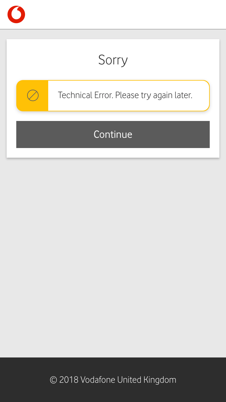
The reviewed critique explains that the card-payment screen can appear after a charge-to-bill failure. That makes the transition a recovery journey: the interface needs to explain why the previous attempt failed and what the customer can do next, rather than present an unexplained change of payment method.
Decision 3 — Work within payment constraints
Stakeholder review confirmed that only one saved card was permitted at a time. Card replacement and editing therefore needed to work within that constraint. The design scope did not include a multi-card wallet.
Decision 4 — Make actions and states explicit
The work distinguishes adding a card, saving it, editing it and paying. Proposed wording and confirmation states aim to make the effect of each action clear. The original case study also describes mobile-number editing, SMS verification guidance, loading feedback and payment confirmation.
Collaboration and trade-offs
The reviewed critique records a dialogue between design recommendations and product constraints. Some recommendations required new UI; others were affected by operating-company differences or existing platform behaviour. This provides evidence of iterative stakeholder review, without assuming every recommendation was implemented.
Delivery and outcomes
The designs went live. My work covered the redesign and handover of account-access and payment journeys. The release date and project duration are not confirmed, and no post-launch feedback or measured results are available. No conversion or usability uplift is claimed.
Reflection
A payment journey needs to preserve context across authentication, method selection and failure recovery. Reviewing the full sequence helped connect individual interface changes with the wider task: understanding the purchase, choosing a payment method and recovering when an attempt fails.