
Project Overview
Hays’ regional websites had evolved independently, leaving teams with duplicated components, inconsistent interfaces and difficult publishing workflows. I led the design-system workstream to turn those fragmented patterns into Hays Unify: a shared foundation for designers, developers and content editors.
Over nine months, I worked with the UX Design Manager, a junior UX/UI designer, the CMS specialist and the Development Manager. My contribution covered the audit, component architecture, variable-based foundations, responsive patterns, documentation and design reviews.
The scope supported a wider programme to consolidate 32 websites. The detailed audit focused on the UK and US experiences plus nine relevant microsites and specialist sites. My focus was the shared system supporting that programme.
Reported outcomes: design time per page fell from five days to two, component reuse rose from 25% to 75%, and six teams adopted the system. Measurement details are discussed in Outcomes & Impact.
The system served as an operating foundation for the wider platform programme. A reusable button or card has limited value if teams still compose pages differently or cannot determine when to use it. Connecting foundations to sections and templates gave the work a practical purpose: help teams build recognisable experiences while giving content editors structures they could use within the CMS. This connected design consistency with the actual work of publishing and maintaining regional websites.
The Challenge
The central challenge was to create global consistency while retaining useful regional differences. Similar needs were being served by different components, and local teams managed their own layouts, navigation and content.
Who The System Needed To Support
Designers needed reusable patterns; developers needed clear behaviour and implementation rules; CMS editors needed reliable page-building sections. The intended benefit for candidates and employers was a more consistent experience across markets.
Constraints
Legacy components and code could not simply be discarded. The solution had to respect existing brand guidance, accommodate regional and translated content, work within CMS publishing constraints and progress alongside a fixed development deadline.
The difficult decisions concerned what to standardise and what to preserve. A regional difference could represent duplication, but it could also reflect a valid content or service requirement. Removing every exception would risk a system that looked consistent yet failed local needs. The design challenge was therefore to create a shared default and a considered route for exceptions, supported by enough documentation for teams to understand the intended boundaries.
Research & Insights
I began with stakeholder and subject-matter-expert sessions, then agreed the audit estate before reviewing individual patterns. This established a clear boundary and reduced the risk of discovering missed regional requirements late in delivery.
The audit was a form of product discovery for the system itself. It examined where repeated patterns solved the same need and where apparent similarities concealed different behaviours. Grouping components by purpose made the comparison more useful than a visual inventory alone. Stakeholder and CMS context then helped connect those findings to publishing and implementation constraints, so rationalisation decisions reflected how teams worked as well as how the existing pages looked.
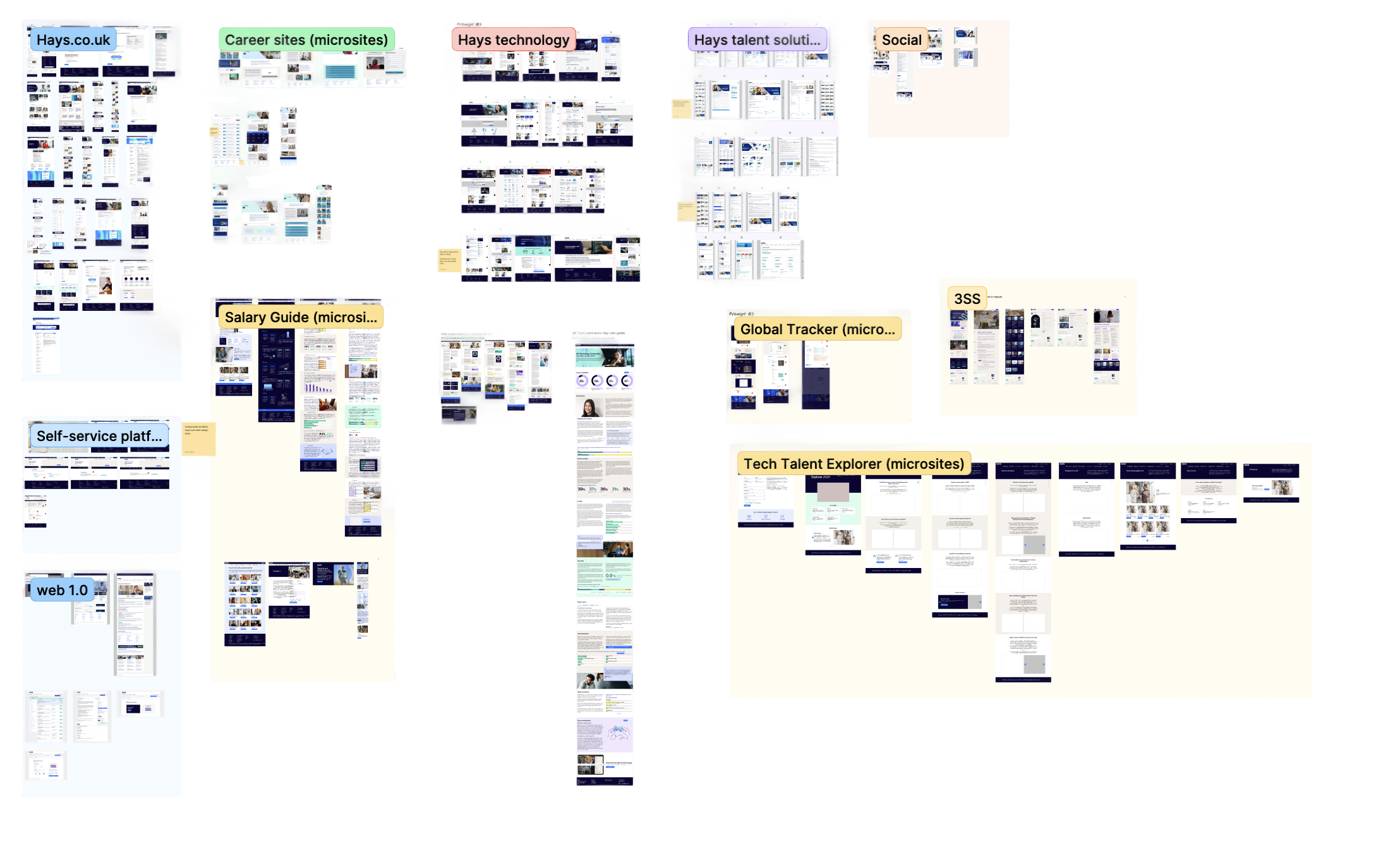
From Websites To A Component Inventory
I mapped navigation, forms, cards, search, listings and content modules in FigJam, then grouped components by the role they performed. Comparing them side by side exposed duplication, missing states and meaningful regional differences.
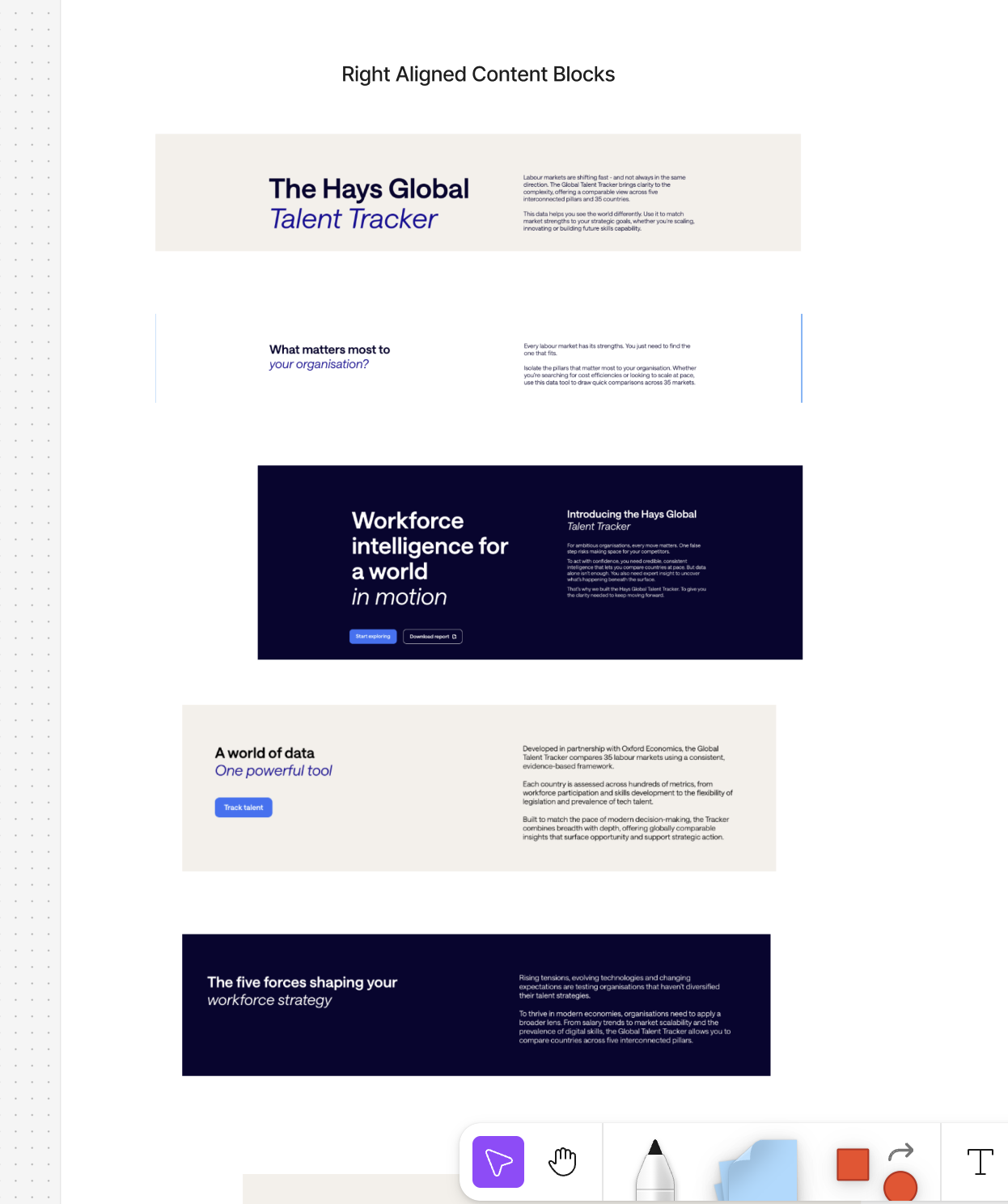
The Findings That Shaped The Work
The existing Glow library was incomplete, regional libraries lacked shared naming, and hard-coded values made broad changes expensive. Responsive behaviour, interaction states and accessibility were inconsistent. These findings led to a shared architecture, semantic variables and documented component behaviour.
Design Decisions
Reuse Without Losing Regional Requirements
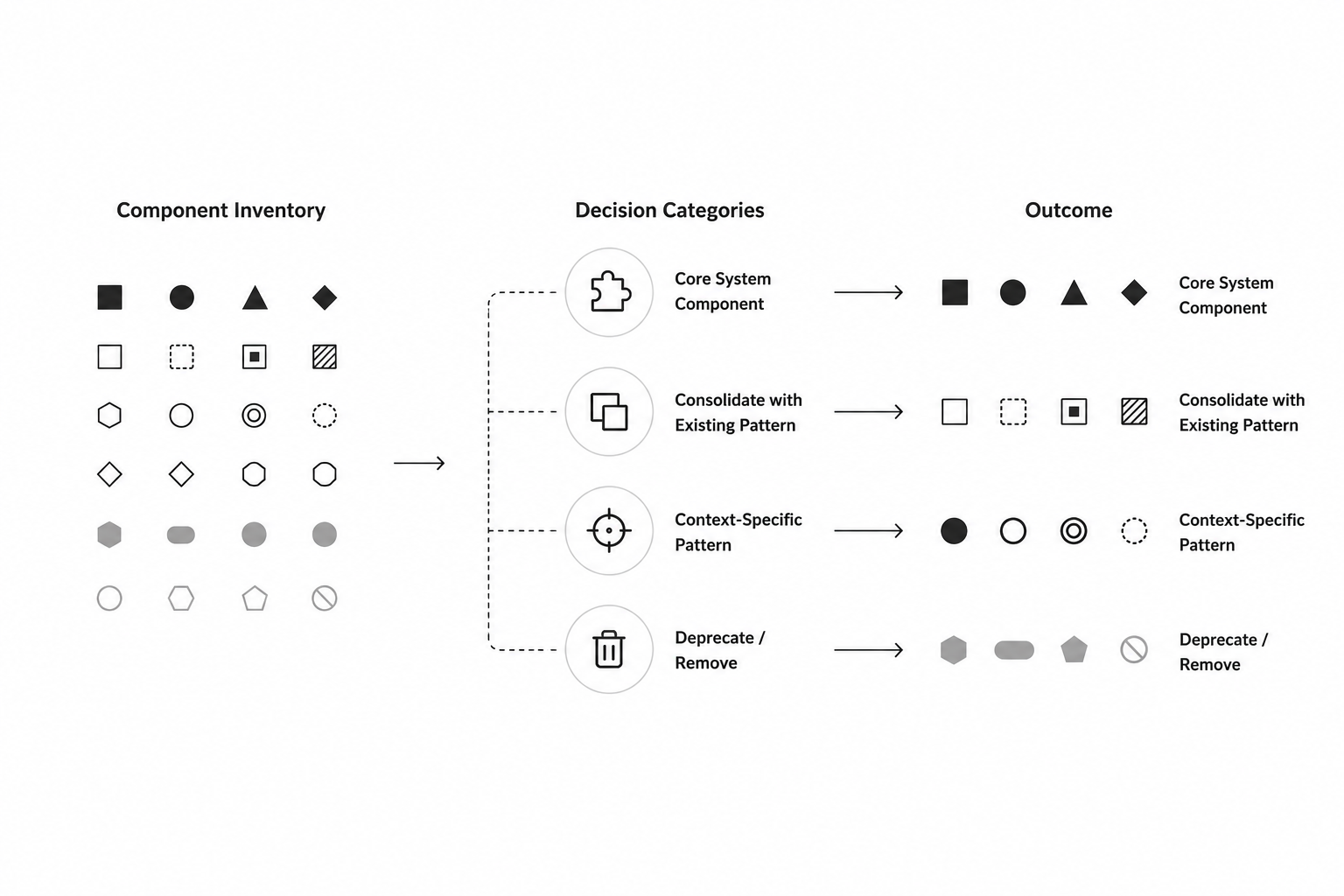
I did not treat the UK site as the complete answer or automatically remove single-use patterns. The inventory was assessed against frequency, content needs, accessibility, brand fit and technical feasibility. Patterns were categorised as core, consolidated, context-specific or deprecated. This kept the central library lean while preserving valid local requirements.
The architecture gave each level of reuse a clear role. Foundations controlled shared values, components defined repeatable interactions and sections connected those pieces to publishing needs. This reduced the pressure to make one component accommodate every possible page requirement. Semantic variables added another layer of clarity by naming the purpose of a value, helping teams reason about changes without searching for every instance of a raw colour or spacing measurement.
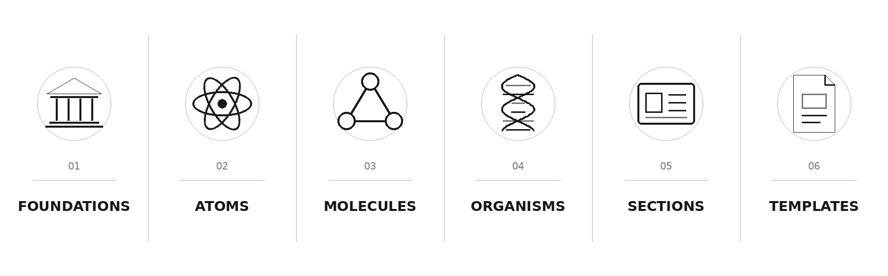
A Connected Architecture
I organised the system into foundations, atoms, molecules, organisms, sections and templates. Sections and templates connected the component library to real CMS publishing tasks, giving editors approved building blocks without requiring a new layout for every page.
Separate Values From Their Purpose
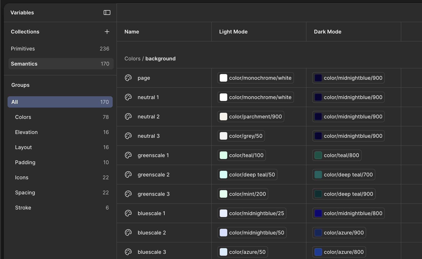
Primitive variables stored raw values; semantic variables assigned them to roles such as text, background and border. Components referenced those roles rather than isolated colours or sizes. This supported central updates and light/dark themes without duplicating the entire component library.
The Solution
Hays Unify brought the approved patterns into one Figma library with documented foundations, components, sections and templates. The brand guidelines supplied the visual starting point; the system translated them into reusable digital rules.
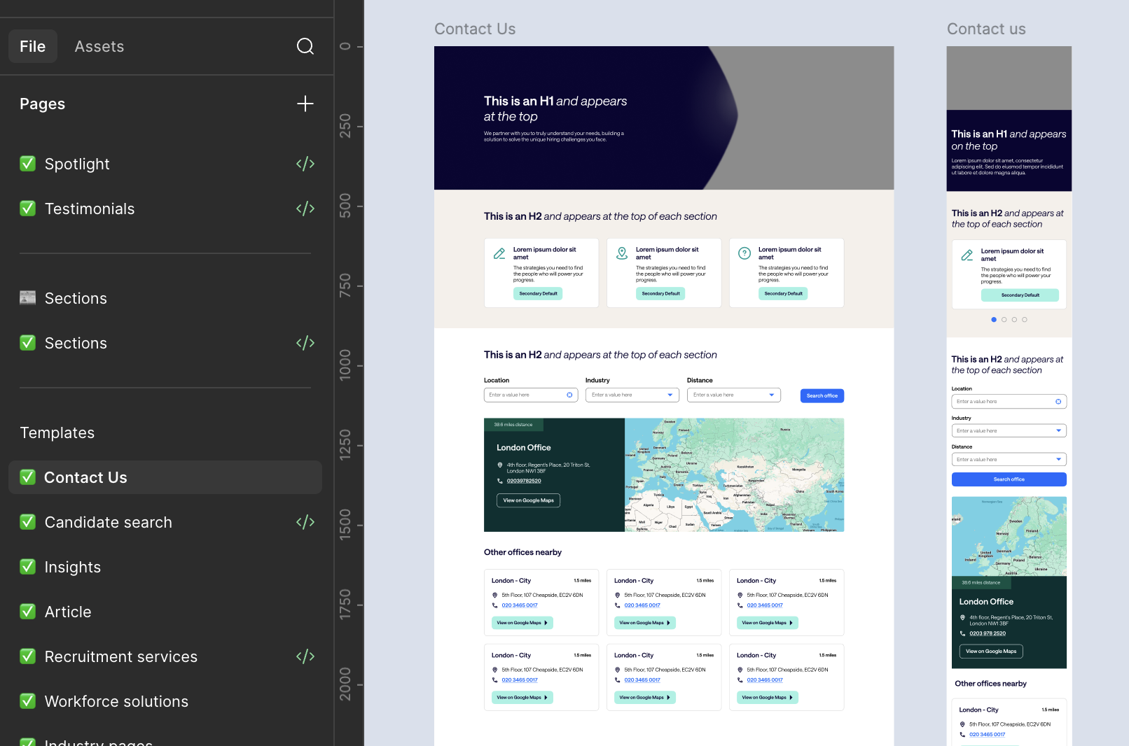
The deliverable combined the visible library with guidance on use and behaviour. Responsive examples and state coverage helped communicate how a component should adapt beyond a single approved screenshot. Sections and templates demonstrated the system in context, making the library easier to relate to actual page-building tasks. That connection was essential for adoption: teams needed to see how the shared patterns could replace existing work, not simply inspect a new collection of assets.
Components With Defined Behaviour
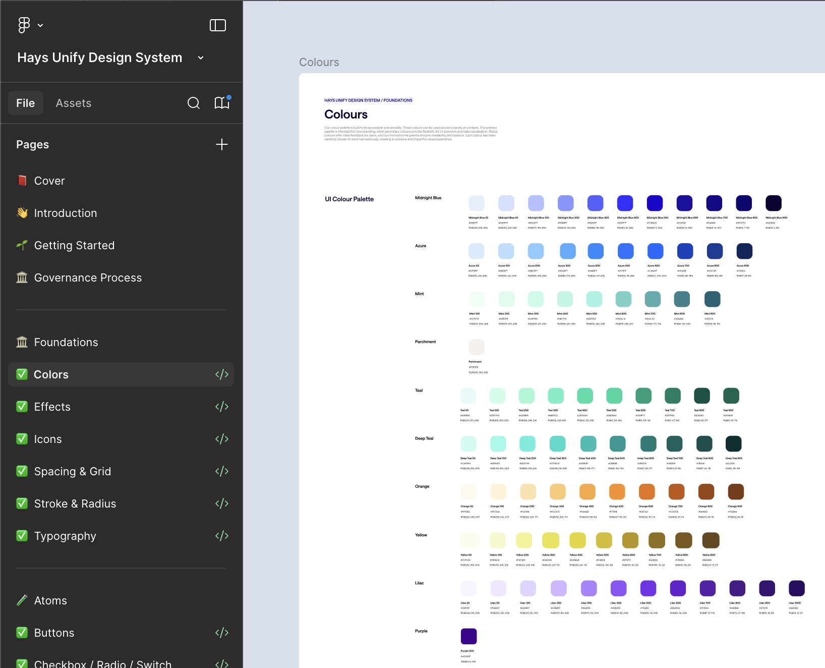
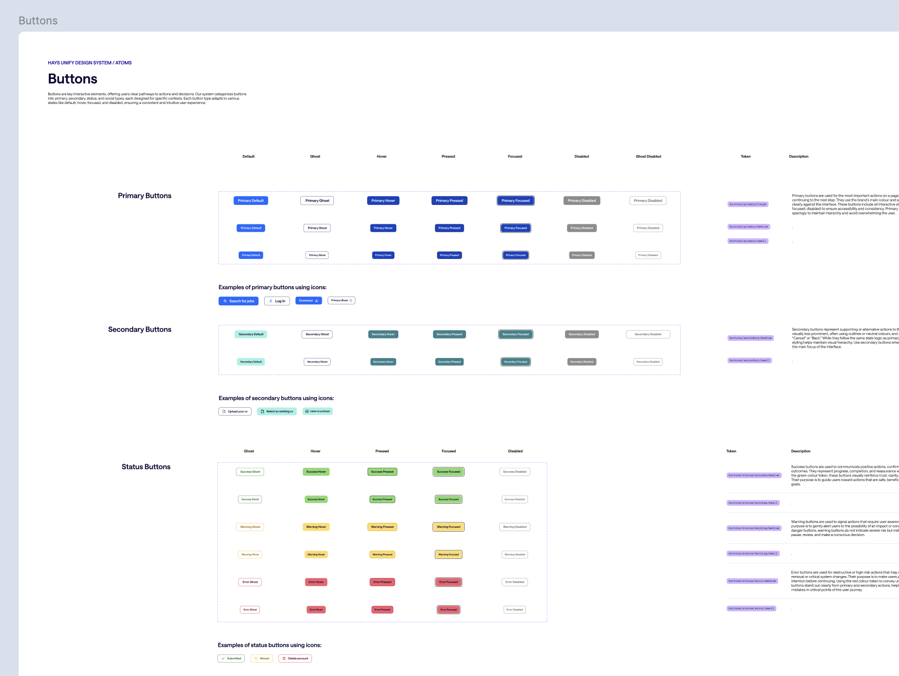
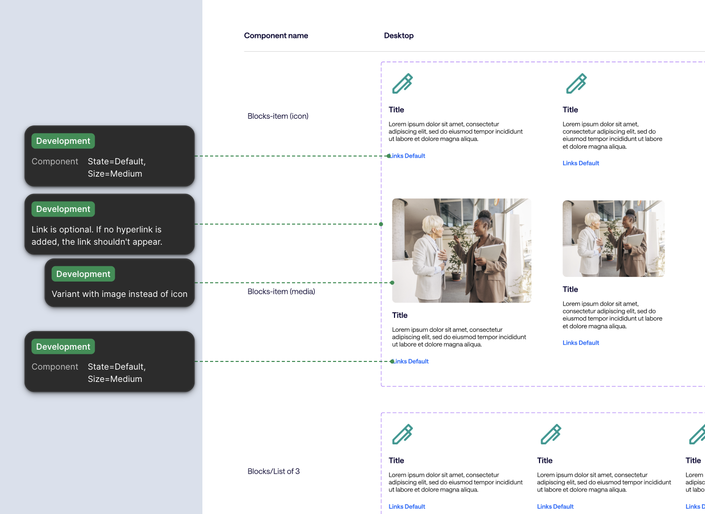
Legacy patterns were rebuilt with variables, controlled properties and required states. Documentation paired the approved design with usage guidance, responsive examples and implementation notes.
From Components To Pages
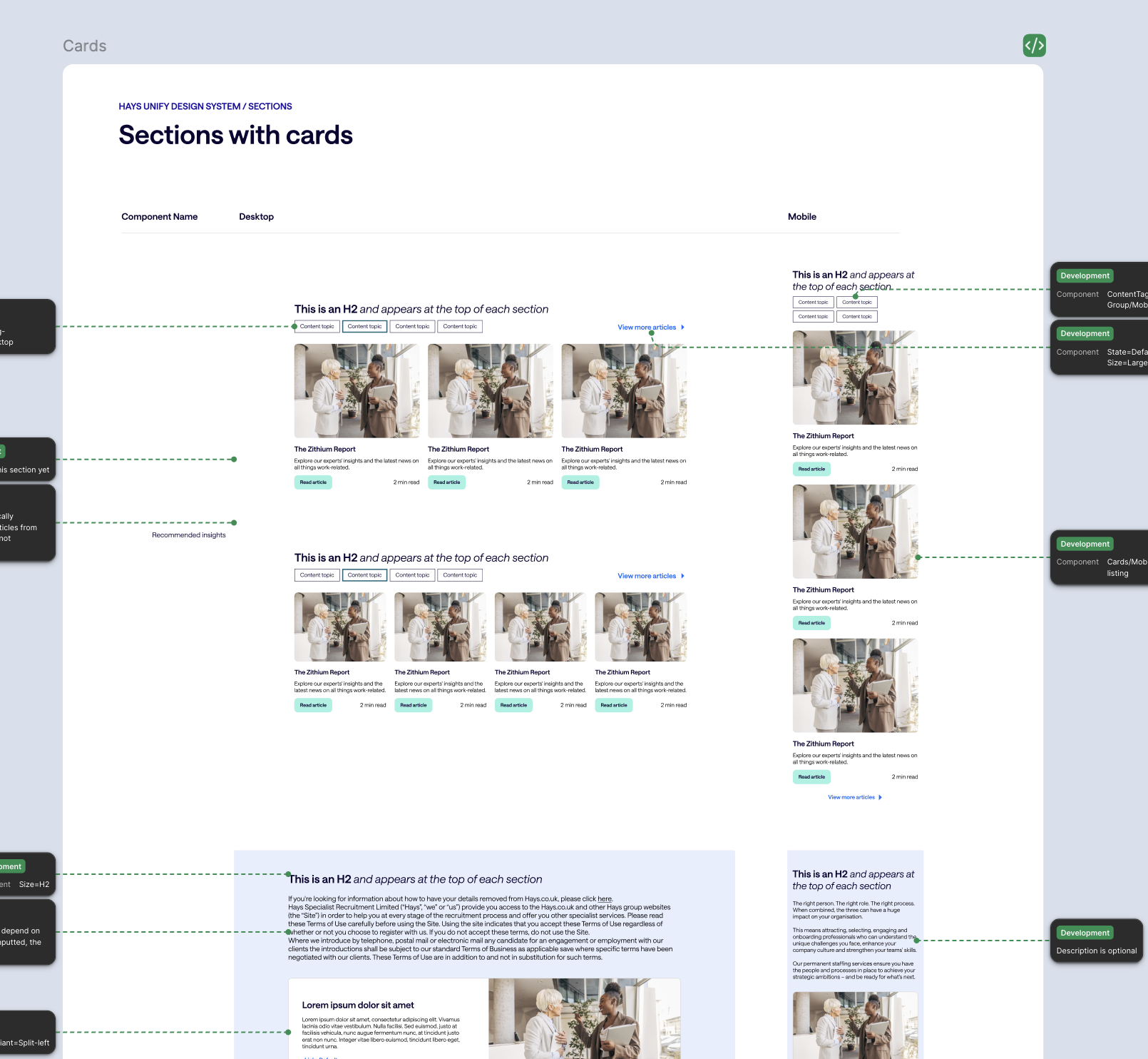
Components were combined into CMS-ready sections, then composed into templates for journeys such as insights, recruitment services and contact pages. Editors could localise content within approved structures rather than introduce a separate local design.
Validation & Iteration
Validation took place incrementally as component groups, sections and templates were completed. Design and development reviewed responsiveness, focus and interaction states, contrast, long content, theme behaviour and alignment between Figma and the coded output.
Reviewing patterns in context helped expose issues that a standalone component check could miss. Long content, responsive layouts and theme changes tested whether shared rules remained useful beyond the default state. Comparing Figma with coded output also examined whether design intent survived implementation. These checks supported consistency and quality, but they should remain distinct from usability evidence about candidates, employers or content editors completing real tasks.
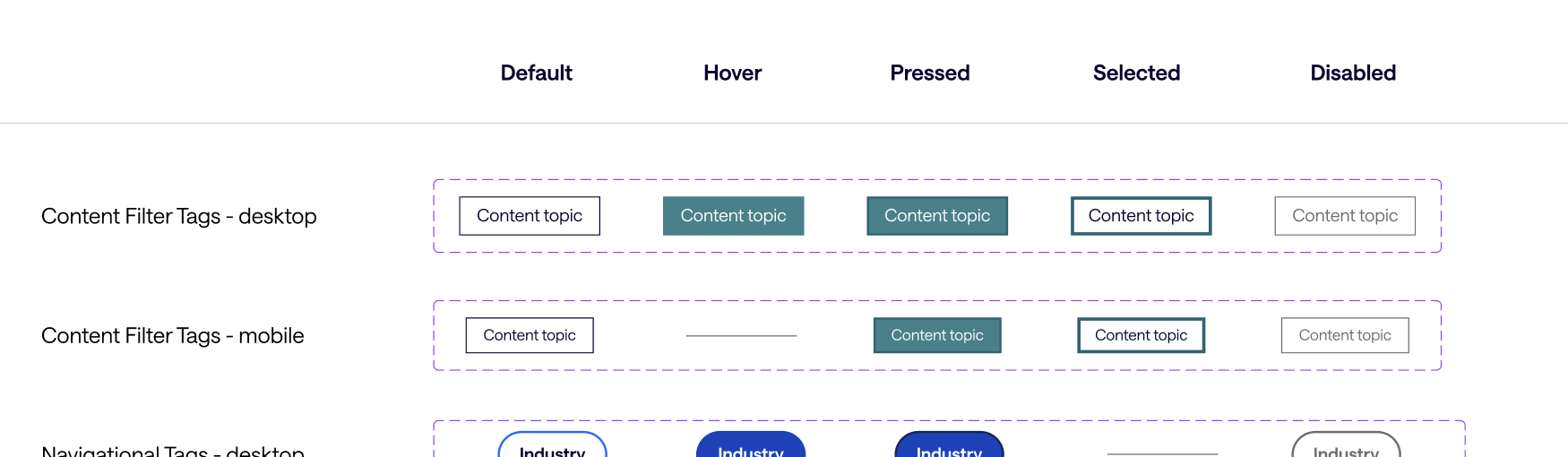
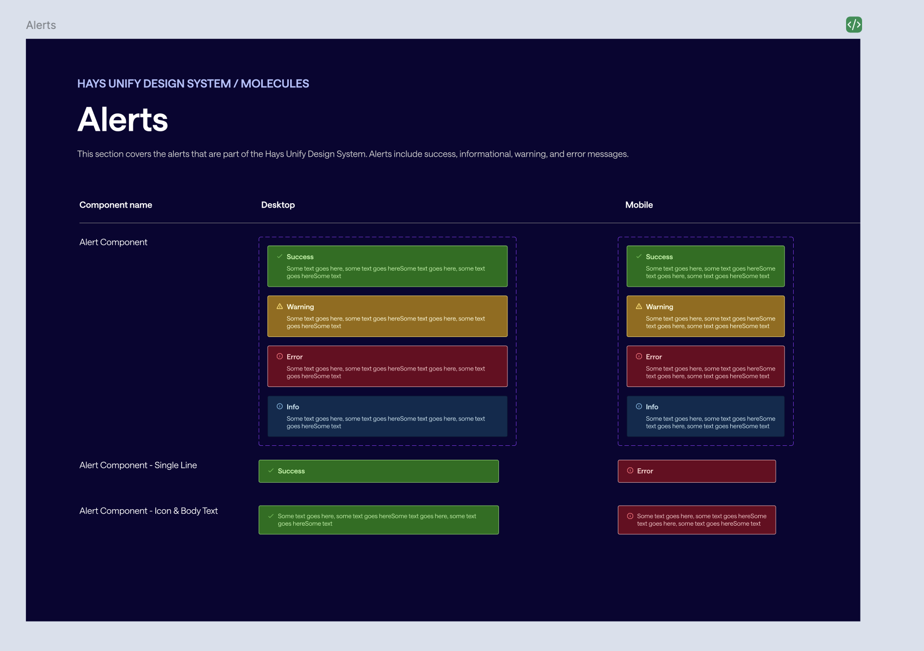
Where reviews identified issues, components were refined before approval. This validation focused on the system and its implementation. Candidate and employer usability outcomes are not reported in this case study.
Delivery & Collaboration
To keep design and engineering moving in parallel, I handed over reviewed component groups incrementally rather than waiting for the entire library. Developer notes captured interaction rules, responsive behaviour, variable references and exceptions. Regular reviews compared coded components with the intended design before publication to Storybook.
Incremental handover made each component group a manageable unit of review. It allowed implementation questions to feed back into design before the entire system was complete. The contribution process addressed the longer-term problem of ownership: new needs require a clear route to assessment, approval and publication. Without that route, local workarounds can quickly recreate the fragmented libraries that the programme was intended to replace.
Ownership And Contribution
I helped define central ownership and a contribution process: establish the need, check existing patterns, assess implications, review the proposal, then design, validate, document and implement the approved change. This provided a route for new regional requirements without recreating disconnected libraries.
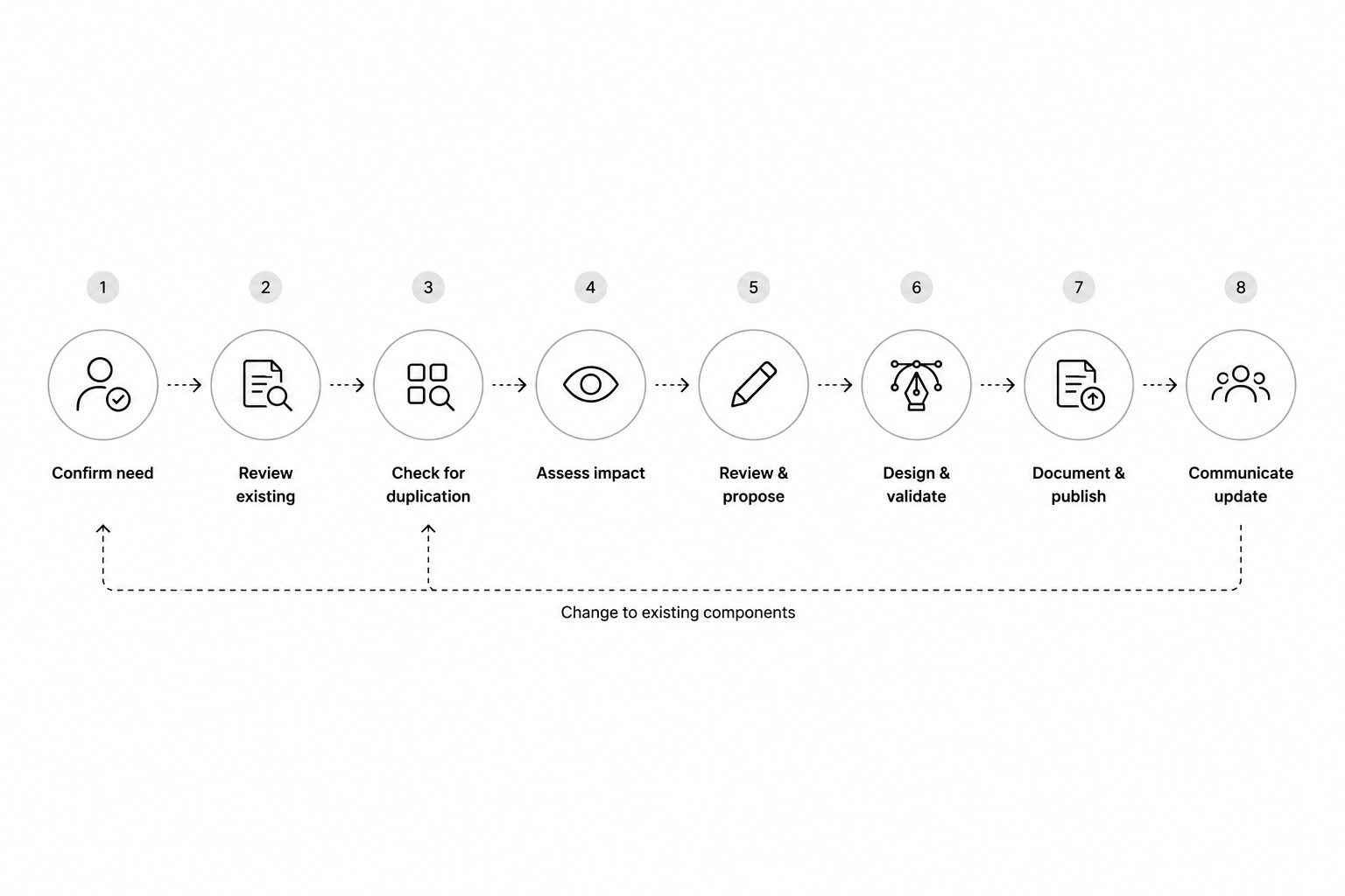
The library was supported by usage guidance and team education. Figma communicated design intent, while Storybook represented implemented components. The proposed governance model set out how ownership and contribution would continue beyond delivery.
Outcomes & Impact
The reported delivery outcomes show improvements in efficiency, reuse and adoption. The measurement period and sample are not documented here, so these figures should be read as reported project results.
| Measure | Before | After |
|---|---|---|
| Design time per page or journey | 5 days | 2 days |
| Development time per component | 3 days | 1.5 days |
| Design-to-development discrepancy rate | 30% | 10% |
| Component reuse | 25% | 75% |
| CMS page creation time | 2 weeks | 4 days |
| Teams using the system | 0 | 6 |
Component reuse increased by 50 percentage points. The CMS time comparison needs a consistent working-day definition before a percentage reduction is stated.
The reported measures describe efficiency and adoption, which are relevant outcomes for a shared system. They do not by themselves establish improved user experience on the recruitment websites. A stronger ongoing evaluation would track how teams use the system, where exceptions arise and how reliably editors can compose pages. Those measures could then be connected with candidate and employer task outcomes to assess both internal delivery value and external experience quality.
Reflection & Next Steps
What The Work Demonstrates
A shared library needs more than consistent visuals. The audit informed which patterns belonged in the system, the architecture connected them to publishing tasks, and documentation and contribution rules provided a way to maintain that consistency.
Next Steps
The next priorities are to monitor regional exceptions, assess editor usability and maintain consistency between Figma and Storybook. Tracking adoption and delivery measures over time would help the team understand where the system creates value and where it needs to evolve.
Longer-term candidate and employer outcomes remain an area for further evaluation; delivery efficiency alone does not establish an improvement in recruitment journey usability.
The next phase should treat the library as a maintained product with users, priorities and evidence. Designers, developers and editors may encounter different obstacles, so adoption feedback should distinguish their needs. Reviewing exceptions and contribution requests over time would reveal gaps in the current patterns. Combining that feedback with implementation checks and journey-level usability research would help the system evolve while preserving the consistency established during delivery.