
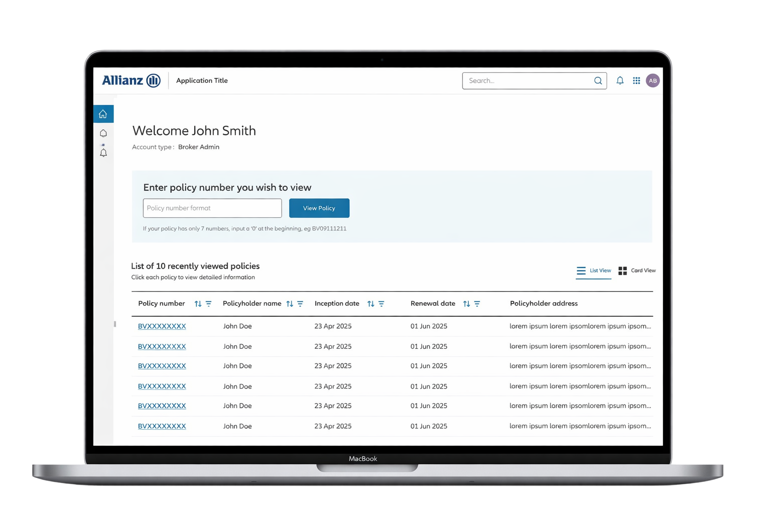
Project Overview
I led the UX and product design for Allianz’s replacement Motor Insurance Database portal. The goal was to give brokers, policyholders and authorised third parties one route to manage fleet vehicles across legacy Coronet and newer INSTANDA policies. My work covered discovery, journey mapping, information architecture, wireframes and interface design.
The product problem was broader than refreshing a legacy interface. Fleet administration crosses policy records, vehicle information and permissions, yet users approach it as one task. A broker wants to locate the right policy and make a reliable update; a policyholder wants confidence that their fleet information is correct. The experience therefore needed a stable task model even when the supporting systems differed. This framing helped connect individual screens to the complete administration journey.
The Challenge
Users needed to find policies, add or amend vehicles and maintain accurate records without knowing which administration system held their policy. Separate portals would expose internal complexity and fragment routine tasks. Role-based permissions, bulk updates, legacy policy support and a fixed delivery deadline shaped the design.
A successful change depended on accuracy as well as speed. Bulk operations could affect many vehicles, while different access roles could perform different actions. The design needed to make the selected policy, available permissions and consequences of an update clear throughout the journey. The key trade-off was reducing repetitive work without removing the checks that help users recognise an incorrect selection or incomplete record before committing a change.
Research & Insights
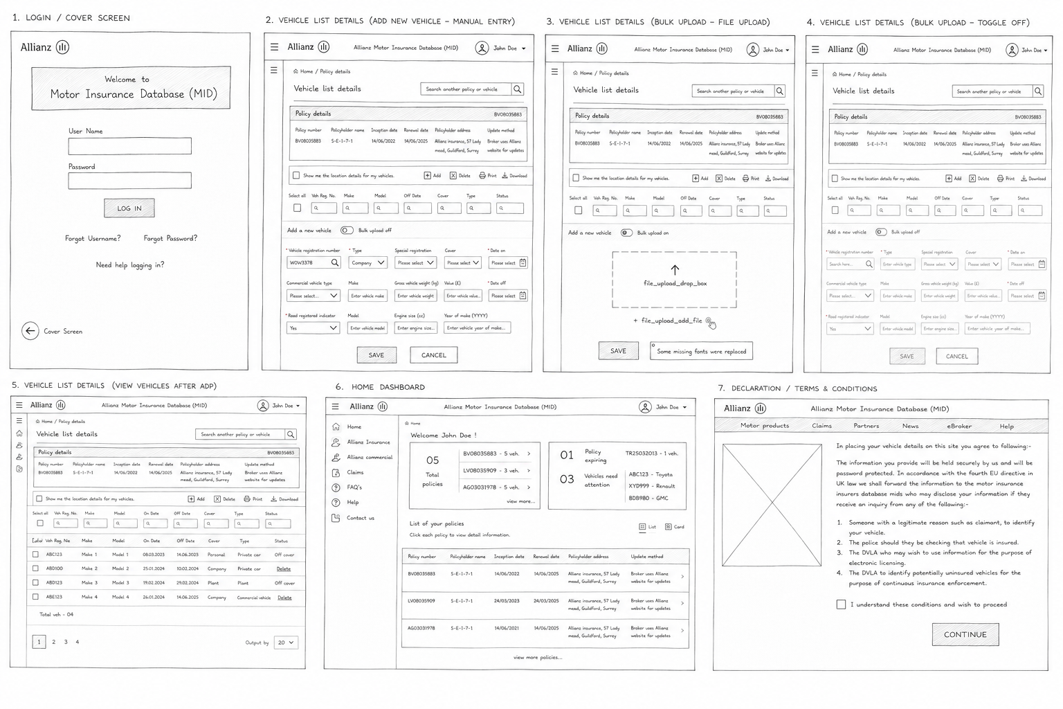
I combined a review of the existing ACMID journey with stakeholder interviews and conversations with policyholders, brokers and sub-brokers. The recurring needs were visible search, fewer repeated inputs, clearer vehicle history and better support for bulk changes. Specialist vehicles and private registration changes also required more flexible workflows.
The existing journey was examined as a sequence of decisions rather than a collection of screens: finding a policy, establishing its context, selecting an action and confirming the result. Stakeholder knowledge helped identify business rules, while user conversations revealed where those rules were difficult to interpret. Bringing these perspectives together made it possible to distinguish necessary complexity from avoidable interface friction, particularly around search visibility, repeated entry and vehicle-history access.
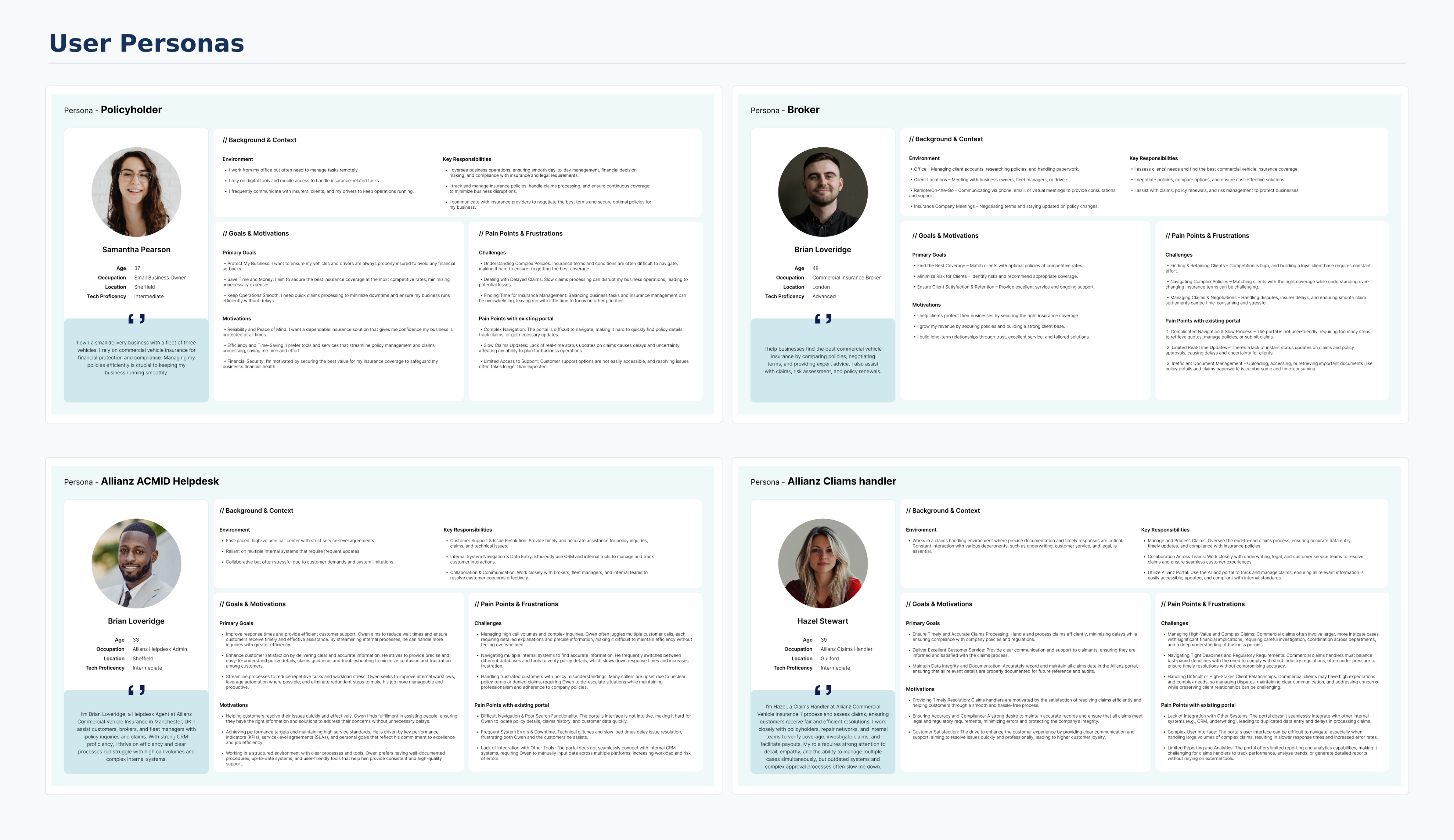
Design Decisions
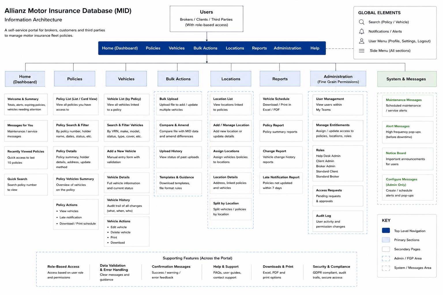
I organised the experience around policy and vehicle tasks rather than the underlying systems. Single-vehicle actions and bulk uploads became distinct routes. A review stage made rejected records visible before submission, while inline guidance and permission-aware actions helped users understand what they could change and how to recover from errors.
Separating single-vehicle actions from bulk uploads acknowledged that these tasks have different recovery needs. A single edit benefits from focused field guidance; an upload needs a way to inspect multiple records and understand which ones need attention. The review stage provided that checkpoint. Permission-aware actions also reduced ambiguity: the interface should communicate the actions available for the current role rather than leave users to discover restrictions after starting a task.
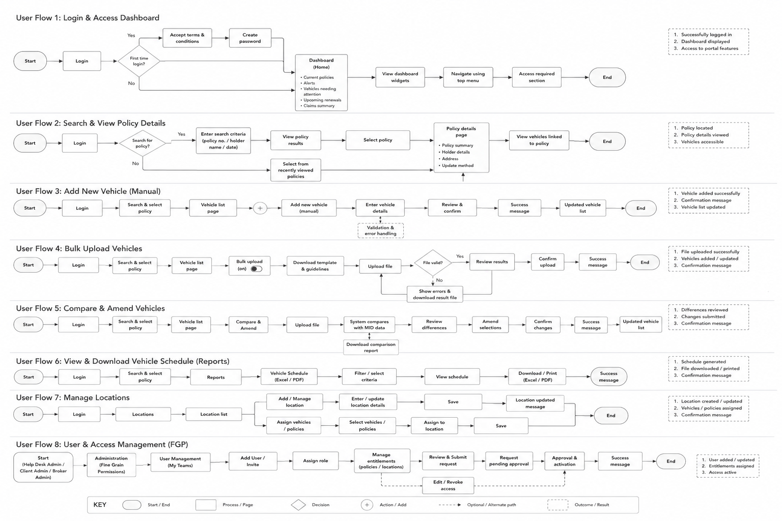
The Solution
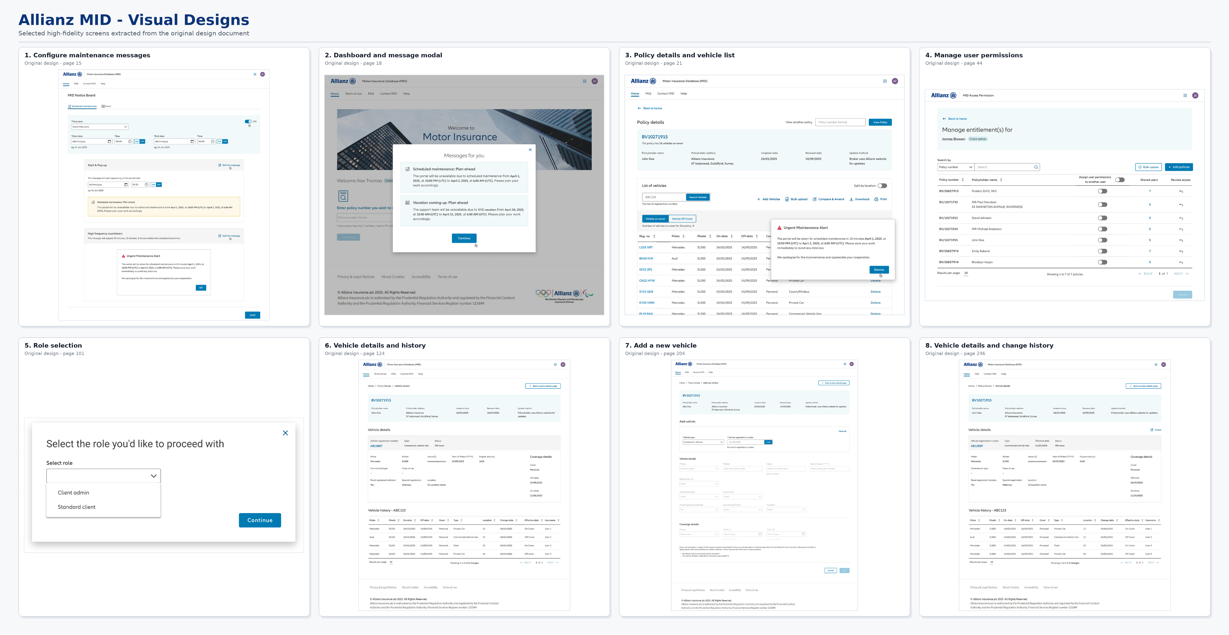
The proposed portal connected policy search, vehicle management, history, schedules and user access through a consistent navigation model. Forms grouped related vehicle and coverage details, and confirmation states explained the outcome of each action. The interface followed Allianz’s existing design-system direction.
The screen hierarchy followed a practical progression from policy context to vehicle information and then action feedback. This gave users a consistent reference point as they moved between searching, editing and reviewing records. Grouped fields helped clarify relationships between vehicle details and coverage information. Confirmation and history views completed the interaction by showing what changed, supporting confidence beyond the moment of submission and providing a route back to the relevant policy.
Validation & Iteration
Scenario-based reviews covered policy lookup, vehicle changes, validation recovery, bulk uploads and account access. Findings informed more visible search, grouped fields, inline errors, upload review and safer destructive actions.
The review scenarios exercised both the intended path and situations where users could lose confidence: a record that fails validation, an upload containing mixed results, or an action unavailable to the current role. These scenarios helped assess whether guidance appeared at the point of need and whether recovery preserved useful context. Further task-based evaluation should distinguish finding the correct record from completing an update; a fast interaction is only useful when the result is accurate.
Delivery & Collaboration
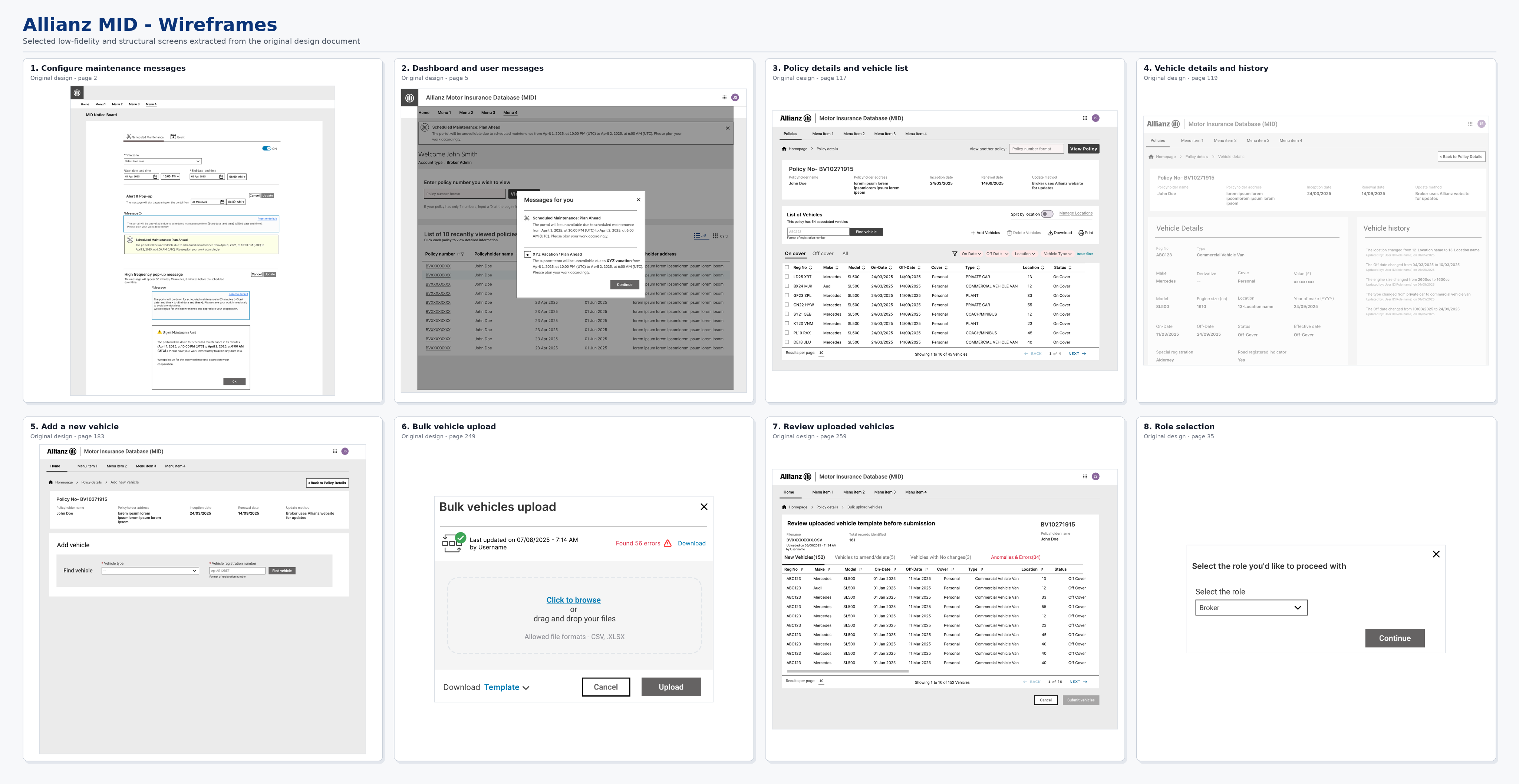
I worked with the Product Owner, Business Analysts, subject-matter experts and developers to connect the interaction design with policy rules, integrations and access requirements. Journeys and wireframes provided a shared reference for discussing scope and feasibility before detailed UI delivery.
The collaboration focused on translating specialist policy rules into understandable interaction behaviour. Journeys and wireframes made dependencies visible early, allowing the team to discuss where a proposed step relied on integration data or an access decision. This reduced ambiguity in scope discussions and gave design and development a common language for reviewing edge cases. Detailed interface work then expressed those agreed behaviours within the established brand direction.
Outcomes & Impact
The intended value was more effective self-service vehicle administration, fewer avoidable errors and less dependence on internal support. The source reports improvements in lookup, completion and support demand, but does not document the measurement period or sample. These claims need that context before they can demonstrate attributable production impact.
The deliverable demonstrates a more coherent model for fleet administration: common tasks can be recognised without exposing the distinction between underlying systems. That is a design outcome, while reduced support demand and improved completion remain performance claims requiring measurement context. A useful evaluation would connect task success, correction rates and support reasons to the specific workflows delivered, rather than treating every change in portal performance as a result of the interface redesign.
Reflection & Next Steps
This work illustrates how a unified experience can absorb system complexity while keeping user tasks recognisable. Further evaluation should measure policy-search success, bulk-upload recovery and task completion for each access role, and confirm which proposed journeys reached production.
The main learning is that unifying systems does not require flattening every task into the same interaction. Consistency should help users retain context, while the detail of a single edit, bulk operation or access-management task should reflect its actual risks. A next phase should evaluate representative roles separately, inspect error recovery and confirm the production scope. This would show where the shared task model works well and where specialist workflows need further refinement.