
Project Overview
As Senior UX Designer, I worked on Rated People’s homeowner job-posting and tradesperson journeys. The main focus was the job form: helping homeowners describe their needs, understand the next steps and submit useful information with confidence. The work included research, flow analysis, workshops, prototypes and usability testing.
The form sits at the point where a homeowner's uncertain need becomes a lead that a tradesperson can assess. A successful submission therefore requires more than removing fields: it needs a description, timing and expectations that are useful to both sides. I approached the journey as a trust and decision-making problem, connecting homeowner confidence with the marketplace's requirement for relevant, actionable jobs rather than treating conversion as an isolated interface metric.
The Challenge
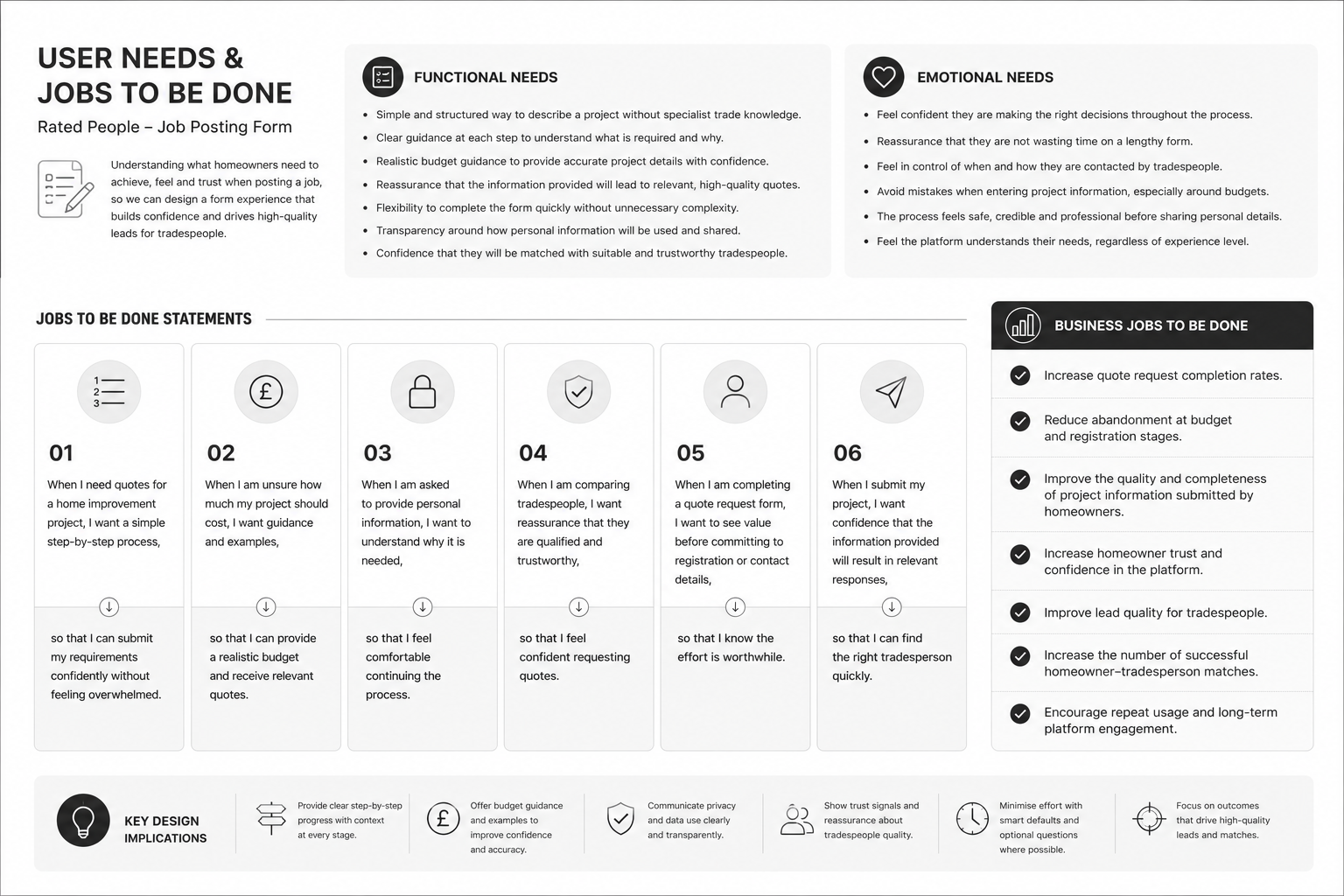
The source records job-form conversion of 21% for the generic route and 18% for the skill-specific route. Drop-off was particularly prominent around job descriptions and budgets. Early registration, personal-data requests and limited reassurance created friction before homeowners understood the value of completing the form.
Homeowners were being asked to estimate costs and share personal information before they understood the benefit of continuing. At the same time, incomplete or unrealistic job details could make a lead less useful to tradespeople. The redesign needed to reduce uncertainty while preserving the quality of the information collected. That meant examining the order of questions, the support available at difficult steps and the point at which registration felt justified.
Research & Insights
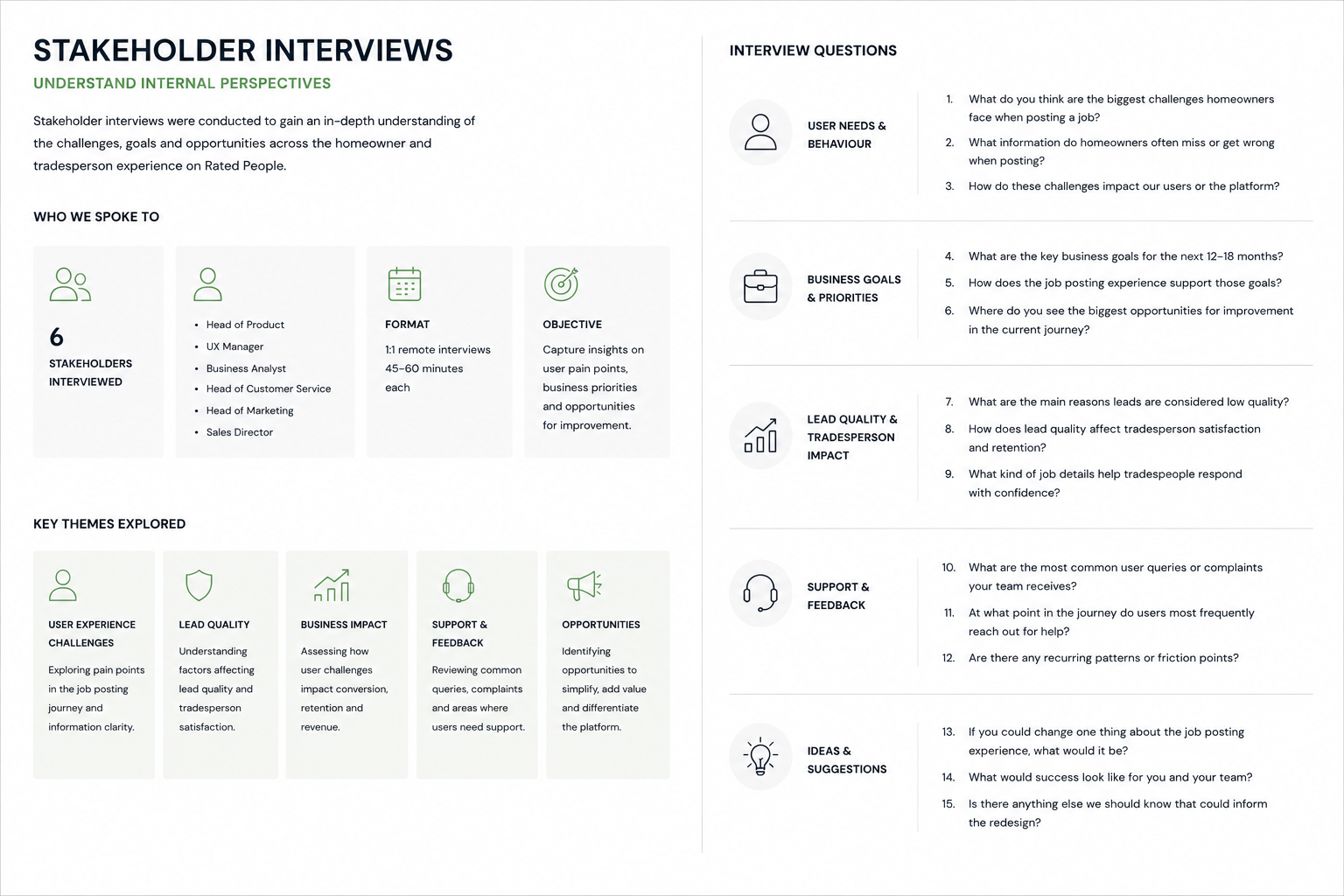
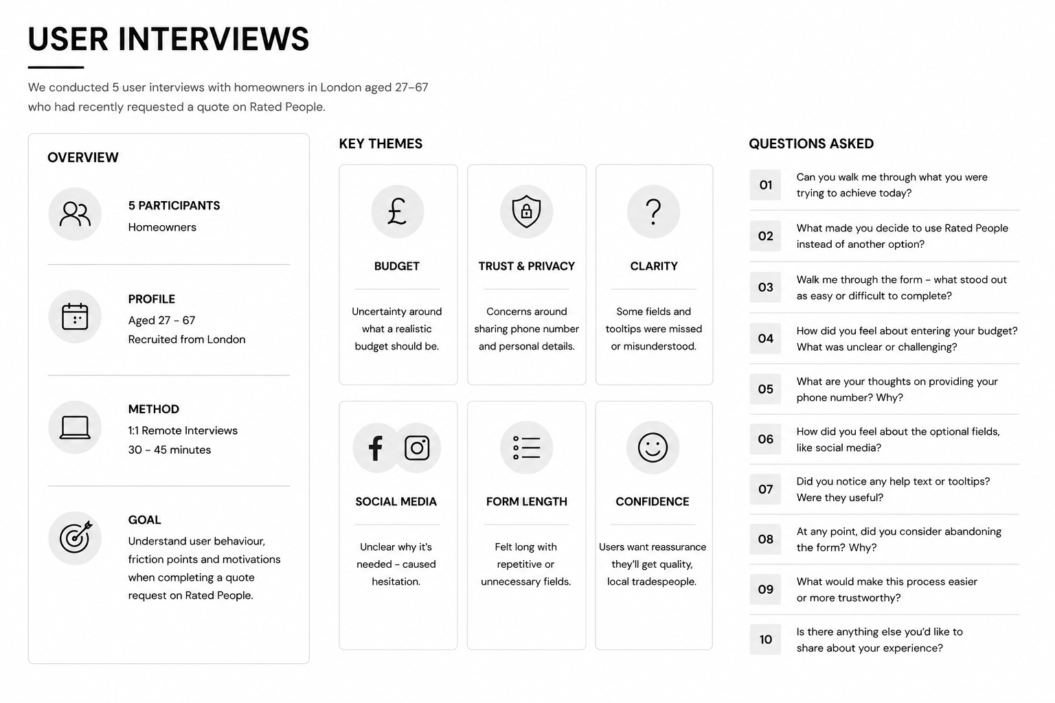
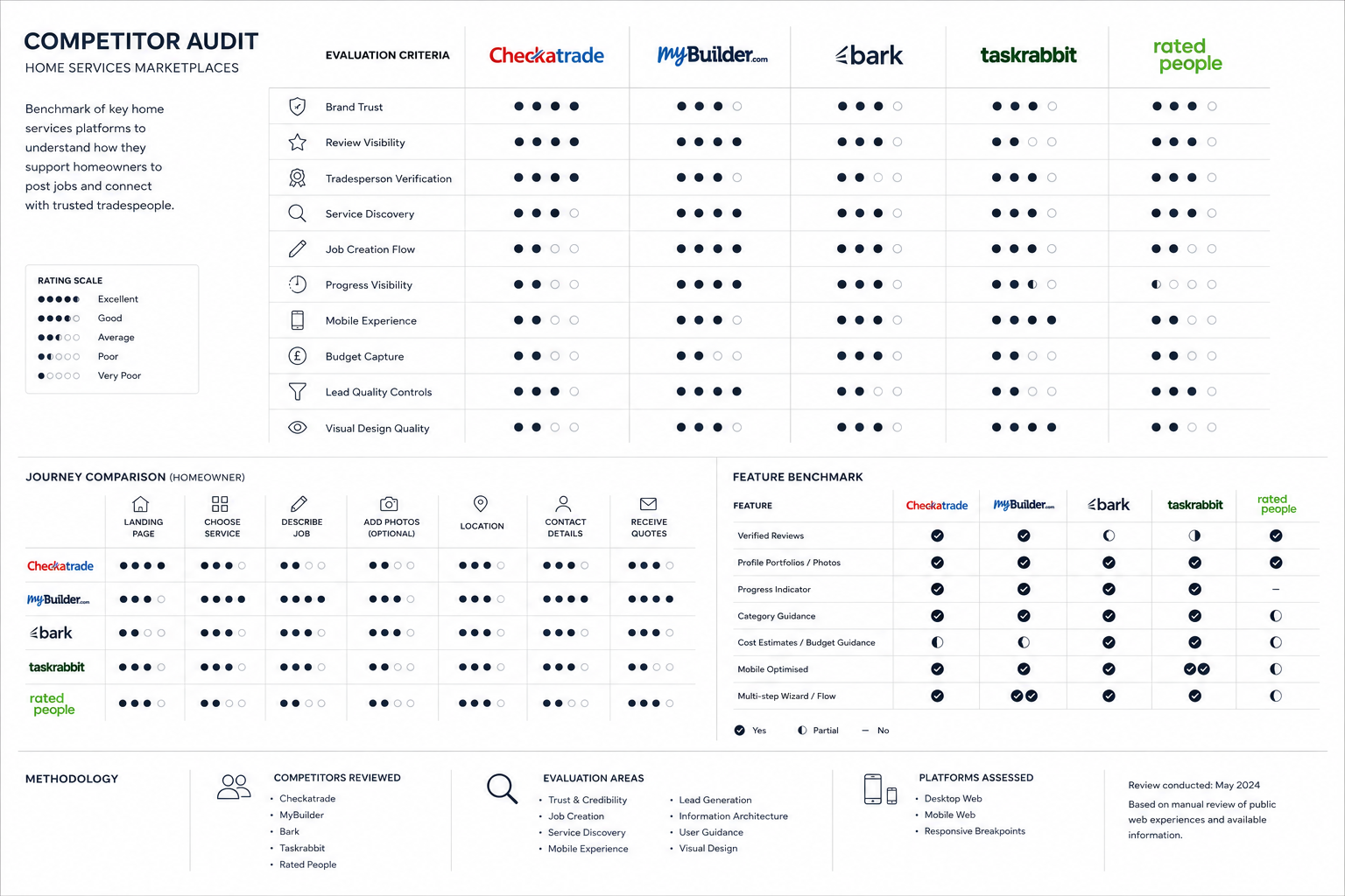
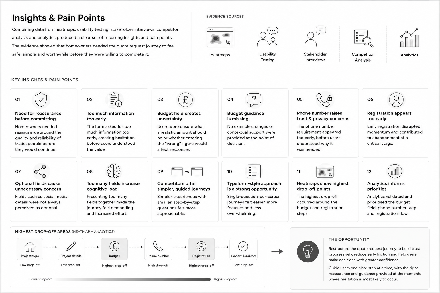
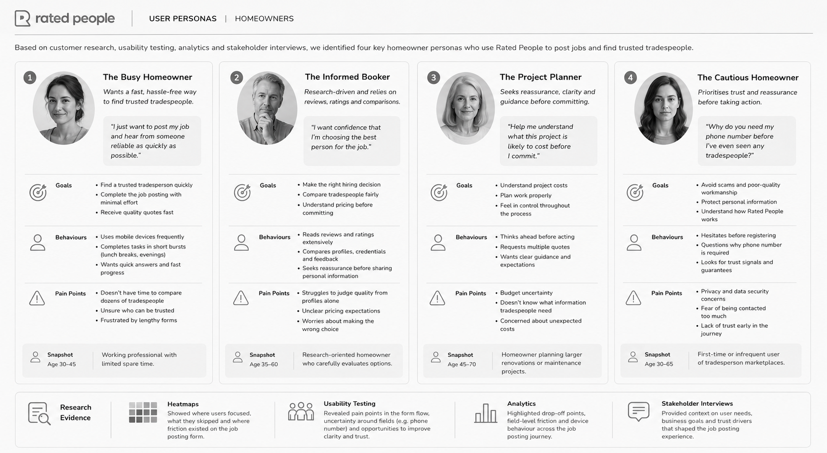
I combined stakeholder and user feedback with current-state analysis, analytics, heatmaps and competitor review. The synthesis highlighted trust, guidance and commitment as recurring themes. Homeowners needed help describing a job and setting expectations; tradespeople needed relevant leads they could assess efficiently.
The source describes ten moderated participants aged 27 to 67, alongside behavioural analysis of the existing form. Budget uncertainty and concern about phone-number requests emerged as practical barriers. Hidden help was easy to miss, suggesting that reassurance needed to be available in context rather than depend on discovering a tooltip. Combining these observations with the conversion baseline helped focus the design on question order and guidance rather than cosmetic changes alone.
Design Decisions
I separated describing the job from providing contact information, placing registration later in the journey. Workshops and card sorting informed three phases: job description, job details and contact information. Contextual guidance, progress cues and confirmation explained what was required and what would happen after submission.
The three-phase structure gave the form a clearer logic: establish the job, add the details needed to assess it, then provide contact information. This delayed commitment until the homeowner had invested in a meaningful description and understood the next step. Contextual budget support and visible guidance addressed uncertainty at the point it occurred. Progress cues were intended to communicate the remaining effort without relying on the user to infer the journey from a long form.
The Solution
The proposed job form used a guided, step-by-step structure across description, photos, timing, budget and contact details. Related tradesperson work explored onboarding, lead relevance and profile completeness. Available visuals document research and structure; restricted original product screens are not presented as public deliverables.
Each stage had a distinct purpose, allowing the interface to ask for relevant information without presenting every requirement at once. Description and photos helped make the need concrete; timing and budget established expectations; contact and confirmation completed the exchange. The related tradesperson journeys reinforced the other side of the service. The solution should be understood as a marketplace experience in which reducing homeowner friction must still produce information that supports a useful response.
Validation & Iteration
Task-based testing and design-sprint feedback involved homeowners and tradespeople. The guided form direction was preferred to the icon-led alternative. Findings informed clearer labels, support messaging and job-description guidance, with prototypes used to review the proposed flow before delivery.
The comparison of guided and icon-led approaches helped examine whether users understood what to do next, rather than only which presentation they preferred. Feedback on labels and support messaging informed the proposed direction. A further study should include realistic, uncertain job descriptions and budgets so the guidance is tested under meaningful conditions. Completion should be evaluated together with the quality of submitted details and participants' understanding of what happens after posting.
Delivery & Collaboration
I worked with product stakeholders and business analysis to review flow changes against requirements and technical constraints. Collaborative sketching surfaced assumptions early, and prioritisation workshops helped agree which improvements to carry into wireframes and prototypes.
Workshops gave product and business-analysis colleagues a way to examine the proposed sequence and question its assumptions. Sketches and prototypes made alternatives easier to discuss than abstract requirements, while prioritisation connected the research findings to a feasible set of changes. The focus was on maintaining a clear chain from observed friction to a design response, particularly when balancing a simpler homeowner journey with the information needed for marketplace operations.
Outcomes & Impact
The existing conversion figures provide a baseline for the problem. Improved completion, lower abandonment and better lead quality were the intended outcomes. The source also includes uplift claims, but no measurement period or sample is documented, so they are not presented here as verified results of the redesign.
The baseline establishes that abandonment was a meaningful product problem, but a conversion increase alone would not explain whether the redesign improved the service. Useful follow-up measures would include where users stop, whether job descriptions contain sufficient detail and whether tradespeople consider the resulting leads relevant. Those measures would help distinguish a more reassuring experience from a superficially shorter form that passes uncertainty to the next stage of the marketplace.
Reflection & Next Steps
Trust must be earned before asking users to commit or share personal information. Further evaluation should measure completion and lead quality together, checking that a shorter, more reassuring journey still supplies the detail tradespeople need to respond appropriately.
The main lesson is that asking for less effort and asking at the right time are different design strategies. A field may be necessary, yet still create friction when its purpose is unexplained or its placement is premature. Future work should examine confidence at the budget and contact stages, then connect form performance with lead quality. This would help the team refine the journey without optimising one side of the marketplace at the expense of the other.