
Project Overview
As Senior Product Designer, I worked on HSBC Kinetic’s mobile-first business banking experience for small businesses, freelancers and sole traders. My contribution covered app structure, core banking flows, interface patterns and prototypes for accounts, cards, transactions and financial insights.
The app supports owners who often manage their business finances alongside many other responsibilities. Their immediate question may be whether money is available, which transaction needs attention or how to complete a routine action. The design therefore centred on a clear account overview and recognisable routes into banking tasks. My role connected the broader banking requirements with the small-screen interactions needed to make those tasks understandable and manageable.
The Challenge
Busy business owners needed quick access to their financial position and routine actions without navigating dense screens. The experience had to balance clarity, security and the breadth of business-banking services. Intelligent insights needed to support decisions while leaving users in control.
Financial information can be technically complete yet difficult to act on. A dashboard that gives equal emphasis to every figure risks hiding the issue that needs attention. The challenge was to prioritise balances, transactions and useful prompts while maintaining access to detail. Sensitive tasks also require clear feedback and confirmation, so reducing steps needed to be considered alongside the user's understanding of the action and its consequences.
Research & Insights
I collaborated with banking stakeholders and reviewed feedback from small-business users. The design focus was helping people move from seeing account data to understanding what required attention. Detailed research methods and participant findings are not documented in the available material.
The project material points to a recurring relationship between visibility and action: customers need to see their financial position, understand the significance of the information and decide what to do next. This provided a useful lens for reviewing dashboard hierarchy and banking flows. Stakeholder input helped frame banking requirements, while user feedback informed clarity. The available record supports that design focus but does not justify a more detailed claim about research coverage or sample size.
Design Decisions
I organised navigation around accounts, cards, transactions, insights and support. The dashboard prioritised balances, key actions and relevant information over a large undifferentiated data view. Insight patterns were explored as supporting guidance, with transparent interaction states for sensitive banking tasks.
Accounts, cards and transactions provided recognisable entry points for frequent tasks. Insights were treated as supporting information rather than a replacement for core account controls. This kept the structure grounded in what users could directly inspect and manage. Consistent hierarchy across flows also helped distinguish an account summary from a detailed transaction view, reducing the need to relearn the interface when moving between related parts of the app.
The Solution
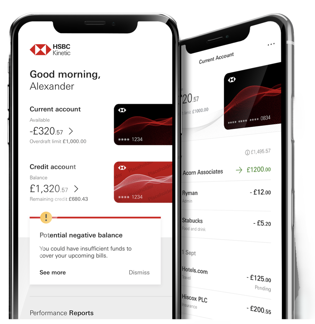
The mobile design connected an account overview with card management, transaction review and money movement. Reusable components and consistent hierarchy supported related journeys across the app. Intelligent and AI-related patterns shown in the project account are design explorations, rather than evidence of specific released capabilities.
The screen direction brought account visibility, card management and money movement into a coherent mobile presentation. Relevant prompts could draw attention to cash-flow concerns, with supporting detail available when the user chose to explore further. Reusable patterns gave related banking journeys a common language. Intelligent insight concepts were intended to help interpret information; their inclusion in the design account does not establish that a particular capability was released or independently validated.
Validation & Iteration
I created prototypes to communicate and review key journeys before development. The account describes feedback on navigation, clarity and feature usefulness, informing refinements to the mobile flows. Specific task scores and participant-level findings are not included in the evidence available for this case study.
Prototypes made it possible to discuss sequence, hierarchy and system feedback before implementation. The important evaluation questions extend beyond whether a control can be found: does the user understand the information shown, recognise the next action and remain confident after completing it? Future testing should use realistic small-business scenarios, including uncertain cash-flow conditions and sensitive transactions. Comprehension, task success and trust should be recorded separately so refinements address the actual source of difficulty.
Delivery & Collaboration
I collaborated with product, banking stakeholders, developers and UX colleagues to translate complex requirements into mobile interactions. Consistent UI patterns and prototypes supported review, iteration and clearer communication of the intended behaviour to engineering.
The collaboration connected product priorities, engineering feasibility and banking requirements with the proposed experience. Prototypes offered a shared reference for interaction behaviour, while consistent components communicated how related states should be presented. Reviews with banking stakeholders helped keep the design grounded in the service context. This cross-functional work was particularly relevant where a seemingly simple mobile interaction depended on account data, security expectations or a wider operational process.
Outcomes & Impact
The work contributed a mobile design direction centred on clearer account visibility and access to banking tasks. The original account lists ratings, awards and percentage improvements, but does not supply dates, named awards or measurement methods. Those claims are omitted pending supporting evidence rather than attributed to this design contribution.
The contribution is most clearly evidenced by the delivered design direction and its focus on account clarity. Broader product ratings or awards cannot establish the effect of an individual interface decision without supporting context. A future evaluation should connect a specific change to a relevant user outcome, such as understanding an account prompt or finding a card-management action. This would create a more defensible account of value than attributing overall product performance to the design work.
Reflection & Next Steps
Financial insight is useful when users can understand its relevance and choose what to do next. Further evaluation should test comprehension, trust and task completion separately, and distinguish overall product performance from the effect of individual design changes.
The central principle is to make financial information useful without overstating what the interface can infer. Customers should be able to inspect relevant details, understand a prompt and retain control of their next action. Further work should test whether insight language is understandable across different levels of financial experience and whether users can recover from mistakes. That evidence would help refine both the presentation of information and the supporting banking journeys.