
Project Overview
I designed the UX and interface for an Environment Agency internal platform within the DEFRA public-sector context. The scope brought incident reporting, safety equipment, assigned actions and event review into a dashboard for staff and line managers.
The platform brings together work that can be at different stages: a new event to report, an unfinished report to resume, an assigned action to complete or a record to review. These activities have different priorities and meanings for staff and managers. My design contribution focused on making those distinctions visible in the dashboard, so users could orient themselves and enter the appropriate workflow without interpreting a single undifferentiated list of records.
The Challenge
Staff needed to distinguish assigned actions from incomplete reports and completed events. Managers needed broader oversight without losing access to their own work. Dense records, varied statuses and role-specific responsibilities required a clear hierarchy and consistent interaction patterns.
Operational dashboards need to support attention as well as access. A due action and an unfinished report may both require work, but they should not be presented as interchangeable items. Managers also need team oversight while retaining a route to their own responsibilities. The challenge was to balance density with a clear task hierarchy, preserving the useful record details while making status, ownership and available actions easier to recognise.
Research & Insights
Operational requirements and stakeholder input informed the task model. The design distinguished creating a report, registering equipment, resuming work and reviewing actions. The available material documents those requirements and the dashboard response, rather than a separate user-research study.
The requirements were organised around what users needed to do with each type of record. This distinguished creation from continuation and review, providing a basis for the dashboard sections and action labels. Role-specific needs informed the difference between personal work and managerial oversight. The material documents the resulting task model and interface; further research should examine how closely that structure reflects staff priorities during everyday operational work.
Design Decisions
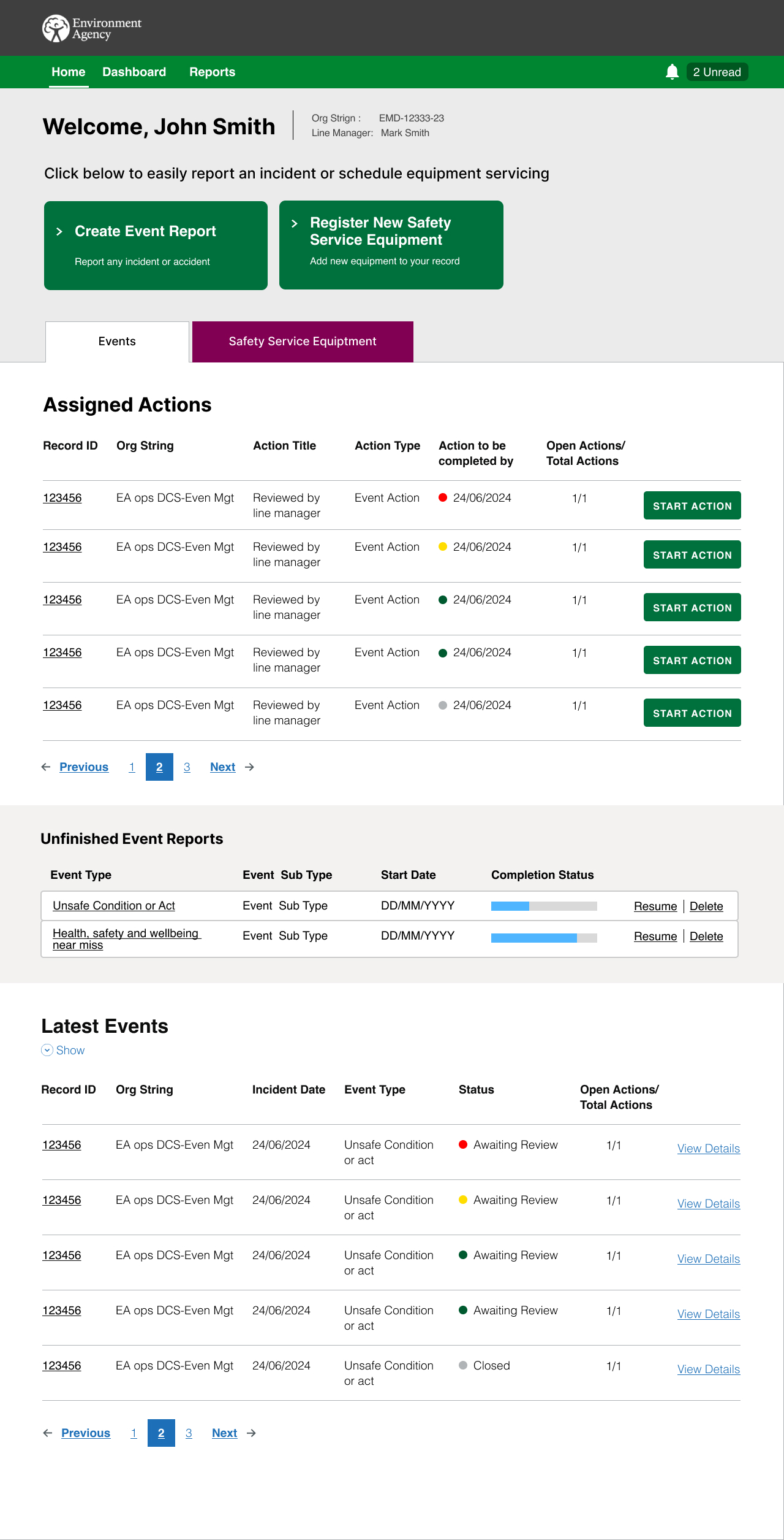
I placed event reporting and equipment registration at the top as primary entry points. Tabs separated related work types, and tables made due dates and available actions explicit. Manager views added team filters and summaries, while resume actions preserved context for unfinished reports.
Primary action cards offered direct routes into reporting and equipment registration, while the tables supported returning work. Explicit actions such as starting an assigned task or resuming a report reduced the need to infer what a record allowed. Dates and statuses supported prioritisation, and manager filters retained access to a broader team view. The rationale was to make the next step apparent while keeping enough detail to identify the correct item.
The Solution
The dashboard surfaced assigned actions, unfinished reports and recent events in structured sections. Role-based views supported personal and team oversight. Reusable tables, status labels, progress indicators and action controls created a consistent visual language for operational work.
Assigned actions, unfinished reports and recent events were grouped according to their role in the workflow. Progress information supported continuation, while record details and action controls supported review. Repeated table and navigation patterns created a consistent structure across work types. The design aimed to provide both an overview and a practical entry point into individual tasks, rather than require users to navigate away before understanding what needed their attention.
Validation & Iteration
The supplied material shows interface designs but does not document task-based testing or specific iteration results. Validation should focus on distinguishing statuses, recovering unfinished work and identifying urgent actions, alongside keyboard navigation and accessible table behaviour.
A useful next study would ask staff to identify an urgent action, resume an incomplete report and locate a recent event, then ask managers to switch between personal and team responsibilities. Testing should examine whether the labels and statuses communicate the right meaning without relying on colour alone. Keyboard access, focus order and table comprehension also require explicit checks. These are proposed validation priorities rather than completed accessibility or usability findings.
Delivery & Collaboration
I worked with business stakeholders, product and delivery colleagues and developers to translate operational workflow rules into screen structure and interactions. The reusable dashboard patterns provided a basis for implementation and future related workflows.
Screen structures provided a way to discuss operational rules with stakeholders and delivery colleagues. Reusable patterns helped make relationships between record details, statuses and actions explicit, giving developers a reference for related workflows. The collaboration needed to preserve the meaning of the underlying process while reducing interface ambiguity. This is particularly relevant when the same dashboard supports both staff completing work and managers reviewing the progress of others.
Outcomes & Impact
The deliverable made the intended reporting and review structure explicit. Better task visibility, completion confidence and role-based oversight were the design objectives; the source does not provide measurements demonstrating their effect after implementation.
The design artefacts show a clearer separation of task types and a consistent approach to action visibility. Their operational benefit would need to be assessed through real use: whether people identify the right work, retain context and complete the appropriate next step. Measures could include selection errors, recovery of unfinished reports and time spent locating assigned actions. No such measured change is established by the supplied screen designs alone.
Reflection & Next Steps
Operational dashboards need to make responsibility and urgency understandable, not simply display more data. Next evaluation should test whether staff and managers can identify the correct action, understand its status and complete it without relying on manual tracking.
The key learning is that a dashboard's structure should reflect the responsibilities it supports. Visual consistency is valuable when it helps users interpret records and act correctly, rather than making every type of information look the same. Further work should validate the task distinctions, language and manager views with representative users. Accessibility review should then test the interaction behaviour, not only the appearance of the final screens.