
Project Overview
I led the UX and interface redesign of the British Gas Business account-management portal, working with the Product Owner and Head of Data Science. The scope covered dashboard structure, navigation and self-service journeys for bills, payments, meters, usage, documents and support.
Business energy management combines everyday administrative tasks with a need to understand costs and consumption. A single-site customer may want a bill or meter-reading route, while a multi-site organisation needs to retain the context of several premises and contracts. The redesign treated the portal as a working account tool. The aim was to connect a useful overview with direct access to the tasks customers need to complete.
The Challenge
The portal needed to support both single-site businesses and organisations managing several premises, meters and contracts. Fragmented information made it difficult to understand account status and find routine actions. Simplification had to preserve the detail required for more complex business accounts.
The same summary can mean different things depending on the account context. A payment prompt, consumption figure or meter-reading request needs to be associated with the relevant site and account. Simplifying the interface could not come at the expense of that relationship. The design challenge was therefore to establish a clear overview, preserve the necessary detail and help users move into a task without uncertainty about which premises or contract they were managing.
Research & Insights
The design was informed by product context and collaboration with data science on account and consumption information. The central need was to surface what mattered for each account and make the next action recognisable. The source does not document a separate interview study or detailed research sample.
Product and data-science input helped connect account information with its practical use. Rather than treating consumption as an isolated chart, the design considered how that information might help customers identify what requires attention. This framing informed the relationship between summaries and task entry points. The available account does not document a separate research study, so the resulting direction should be evaluated with customers before its assumptions about prioritisation are treated as established findings.
Design Decisions
I grouped related tasks into bills, payments, meters, usage, account details and support. The dashboard prioritised account status, payment information and meter-reading prompts. Usage insight was positioned alongside relevant actions so data could help customers understand their situation rather than become another isolated report.
Task-led categories provided a stable structure across different account needs. Bills and payments remained distinct but related, while meters and usage connected operational input with consumption information. Dashboard prompts were prioritised according to their potential relevance to the current account. This approach aimed to reduce the effort of locating a routine action while keeping deeper account information available for customers managing a more complex set of premises and services.
The Solution
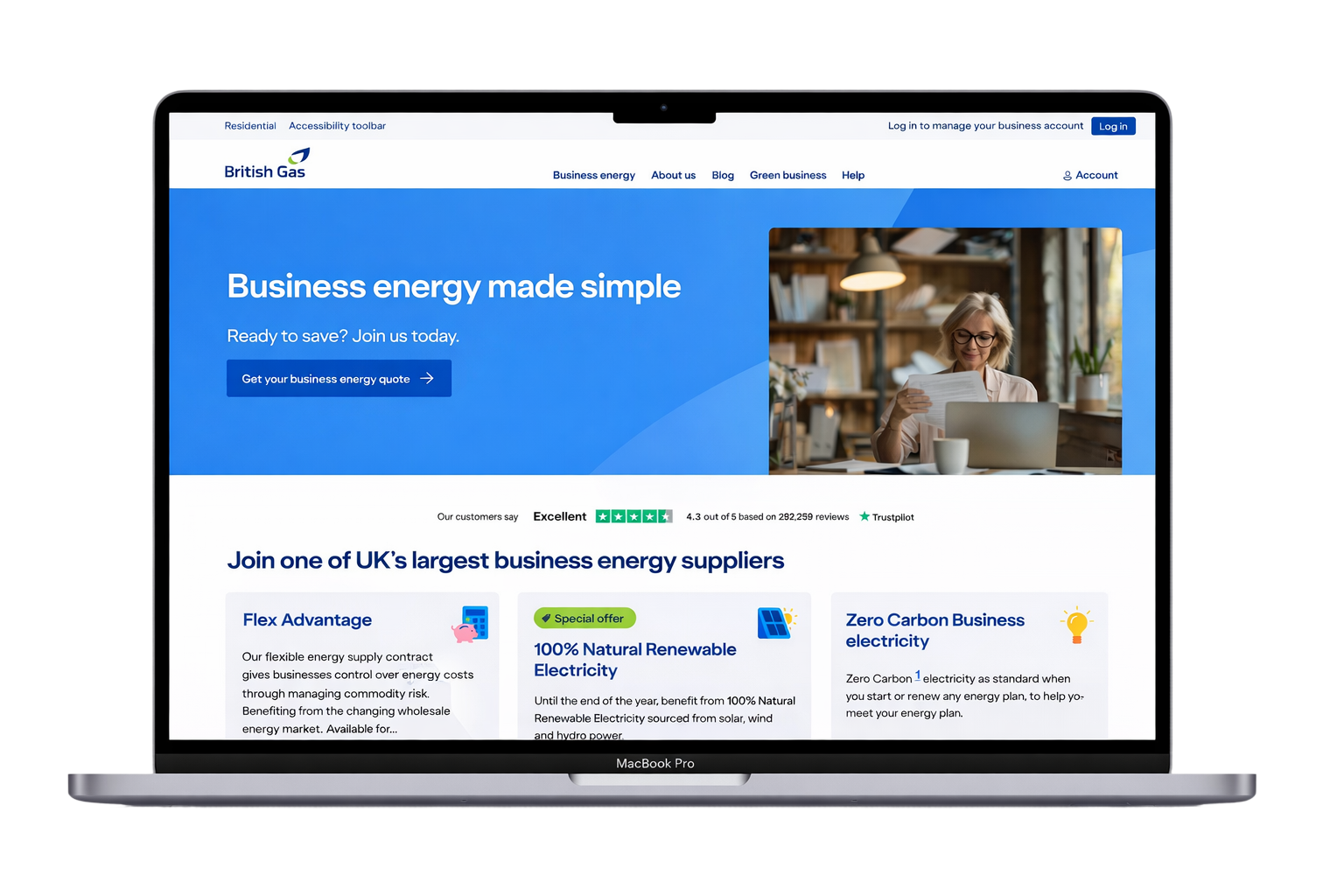
The proposed portal combined a structured account overview with task-led navigation and clearer summaries. Multi-site considerations informed the account model, while data-led prompts explored how consumption and billing information could guide attention. The supplied image shows the business website context; it is not a screenshot of the redesigned account portal.
The proposed overview was designed to establish account status before directing attention to the next useful task. Summaries and prompts gave customers an entry into bills, payments and meter readings, while the wider navigation supported less frequent account and support needs. The design direction linked information and action rather than adding data for its own sake. The public website image provides brand and service context; it should not be read as evidence of the redesigned portal's final screen layout.
Validation & Iteration
A separate usability study and iteration findings are not included in this case study. Appropriate next validation would cover bill retrieval, meter readings, payment understanding and navigation between sites, particularly where users manage several accounts.
The next validation should include both single-site and multi-site customers, because success in a simple account does not demonstrate clarity in a complex one. Tasks should cover selecting the right account, finding a bill, interpreting a payment status and identifying the correct meter-reading route. Observations should capture loss of site context as well as completion. Those findings would indicate whether the summary hierarchy and navigation support the intended self-service experience.
Delivery & Collaboration
I worked with the Product Owner on scope and business priorities, and with the Head of Data Science on the usefulness of account and usage information. Flows, dashboard layouts and interface designs communicated how self-service tasks and data should fit together.
The small team connected design, product priorities and the interpretation of account data. Working with the Product Owner helped define scope, while collaboration with the Head of Data Science informed how consumption information could become useful rather than merely available. Flows and layouts supported discussions about that relationship. The design contribution focused on making the account model and task structure understandable, with further customer validation needed to assess the resulting experience.
Outcomes & Impact
The intended benefits were clearer account visibility, easier routine tasks and reduced support dependency. The available evidence is qualitative and does not establish measured changes in completion time or support demand. These remain outcomes to validate rather than quantified results.
The intended outcome was a portal that made routine business-energy administration easier to understand and complete. A meaningful evaluation would examine successful self-service alongside the reasons customers still contact support. For multi-site users, retaining the right account context would be an important part of that assessment. The available material does not establish those changes quantitatively, so the case study presents the design intent and deliverables separately from benefits that remain to be measured.
Reflection & Next Steps
A useful dashboard connects information with action. Further work should test whether customers can identify the right account, understand what needs attention and complete the relevant task without losing site context.
The work highlights that dashboard clarity depends on the relationship between information, context and action. A concise summary is useful only if customers understand what it refers to and how to proceed. Further work should test account switching, the language used in prompts and the priority of different tasks. Those findings would help refine the portal around real business responsibilities, particularly for customers handling several premises or contracts.