
Project Overview
I led the UX and visual app design for Berry Bros. & Rudd across iOS and Android. The redesign connected cellar management, wine detail, valuations, BBX trading, orders and account information into a more useful mobile hub for customers managing valuable collections.
Wine collections involve more than a list of purchases. Customers need to understand quantity, storage, maturity and value, then decide whether to hold, drink, withdraw or trade. The app needed to connect those decisions without assuming that every collector had the same knowledge or priorities. My contribution focused on turning specialist collection data into a mobile experience that supported both a quick cellar check and a more considered review of an individual wine.
The Challenge
Customers needed to understand what they owned, when wine was ready to drink and which actions were available. Dense cellar data, different levels of wine expertise, marketplace rules and mobile space constraints made clear hierarchy essential. The first release also had to respect backend dependencies and must-have scope.
The tension was between richness of information and clarity at mobile scale. Experienced collectors may want detailed valuations and trading information, while occasional users need a recognisable starting point and understandable terminology. Marketplace and ownership rules add another layer of complexity. The design needed to prioritise the information required for the current decision, preserve access to detail and avoid making commercial discovery compete with essential collection-management tasks.
Research & Insights
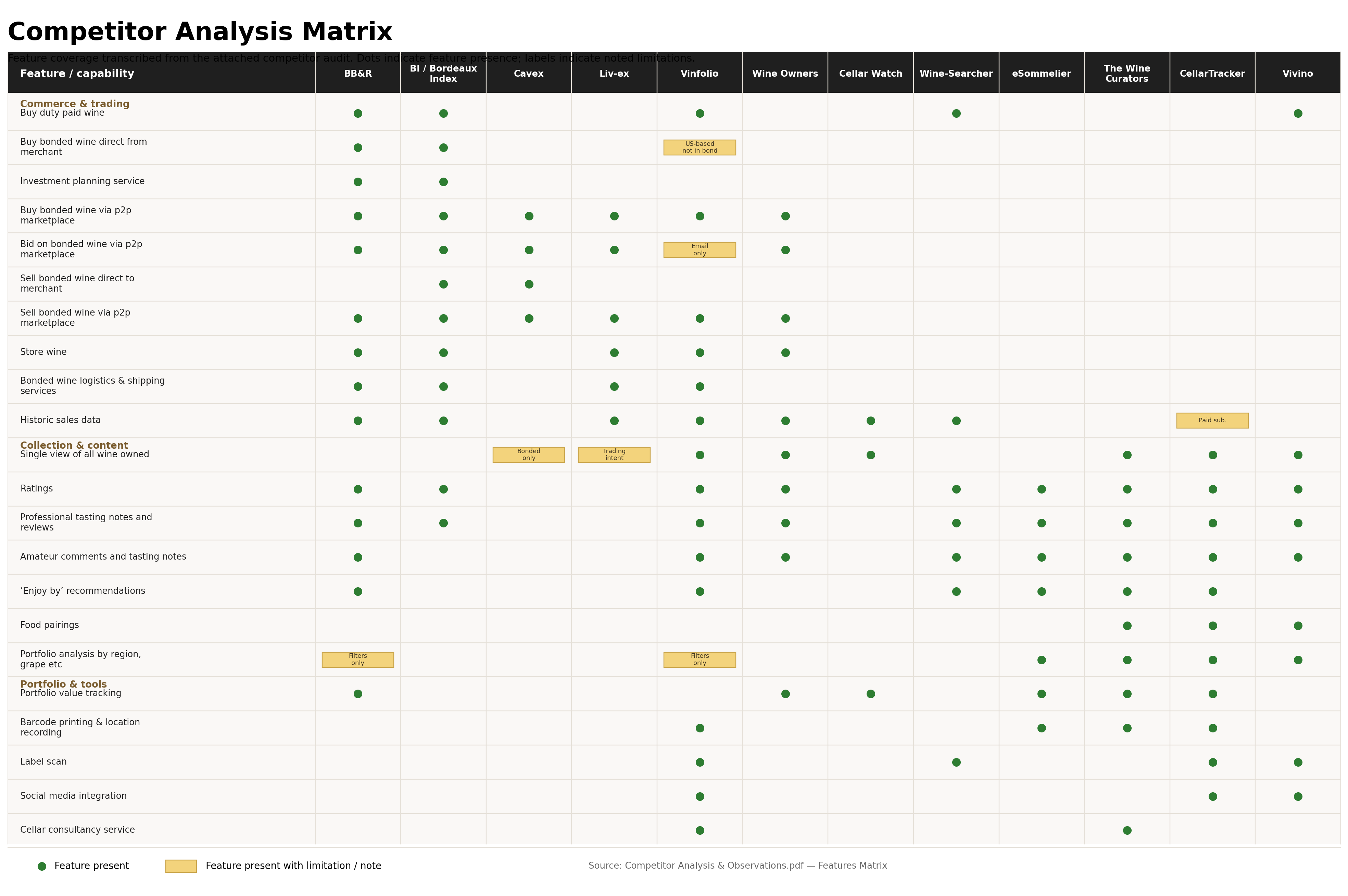
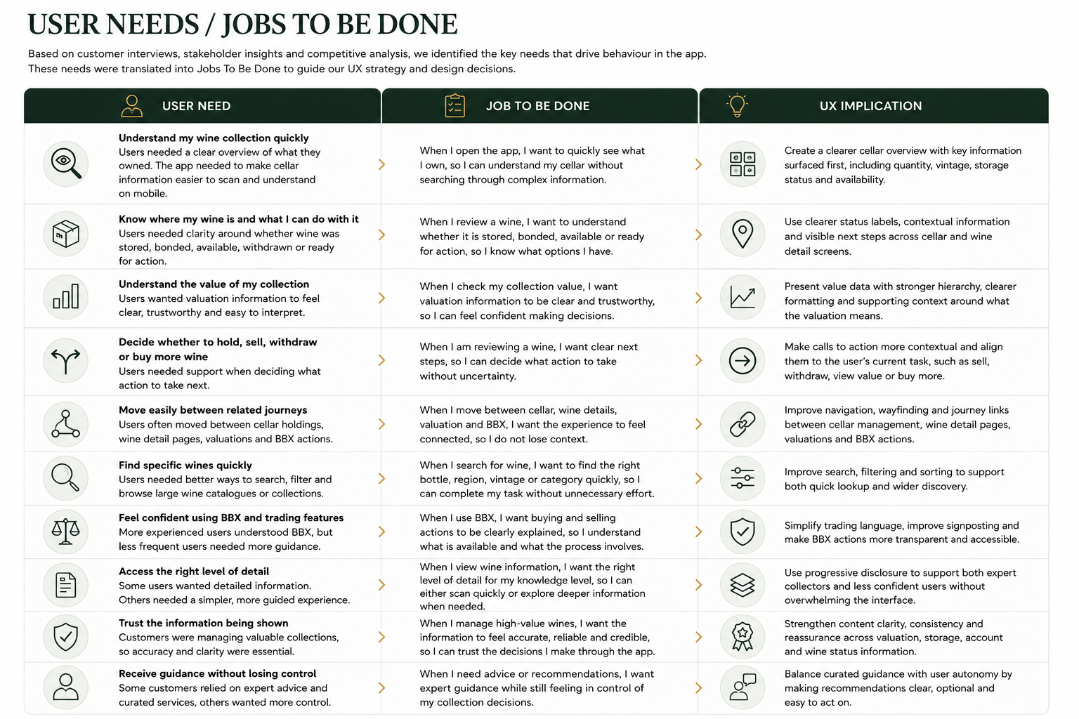
I reviewed customer interviews, survey insight and respondent profiles, alongside stakeholder discussions and competitor analysis. The six customer need states were synthesised into themes around cellar visibility, readiness to drink, valuation clarity and trading confidence. These needs informed the core journeys rather than a feature-led menu.
Discovery included 26 one-hour consumer interviews: 21 existing customers and five UK non-customers. The account describes customers using spreadsheets and other wine services to supplement their cellar management. This exposed a need to bring ownership information and practical next actions together. Customer need states helped organise those differences in motivation, while competitor review provided context for common approaches to cellar visibility, valuation and trading without treating those patterns as a substitute for customer insight.
Design Decisions
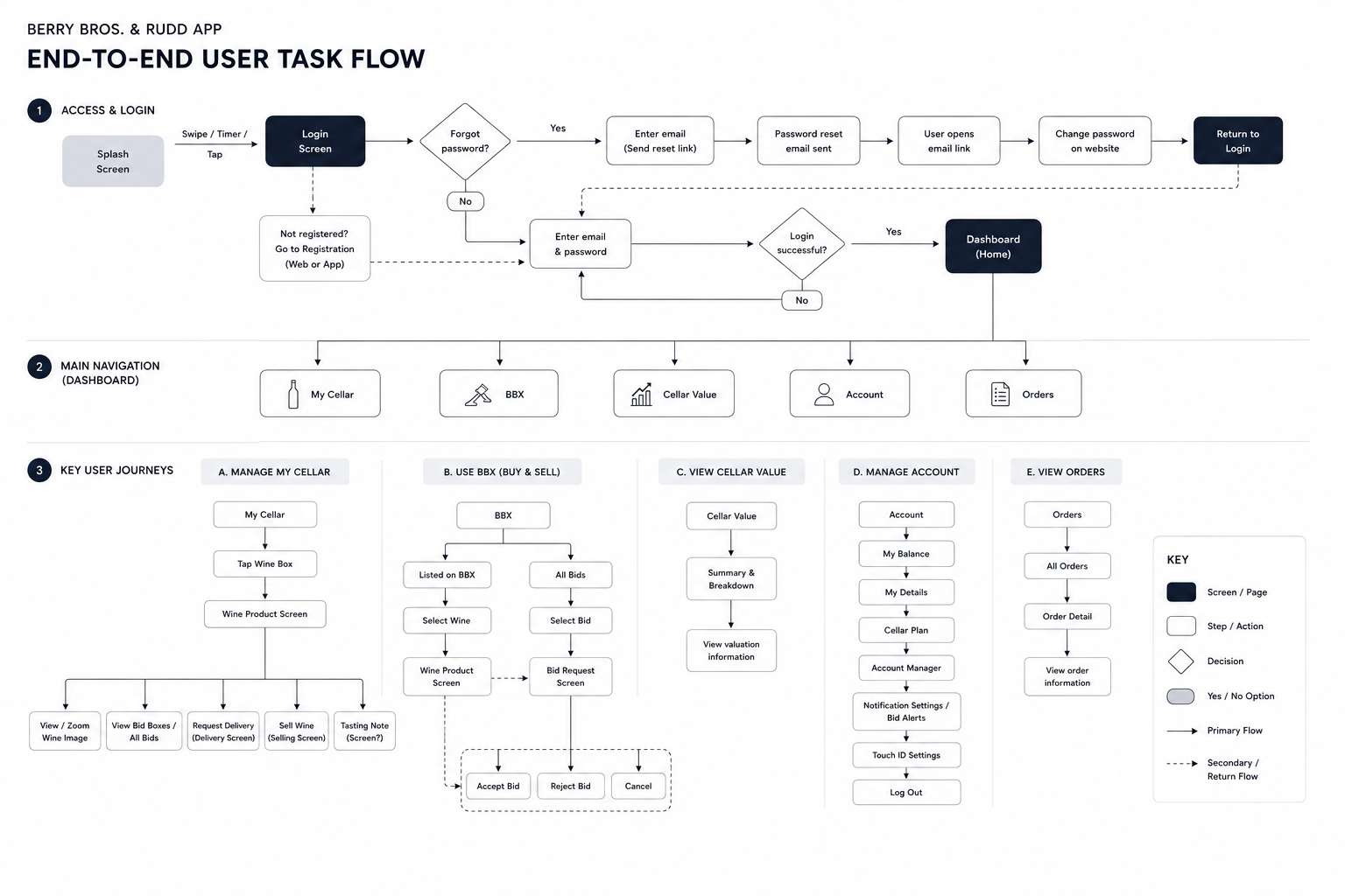
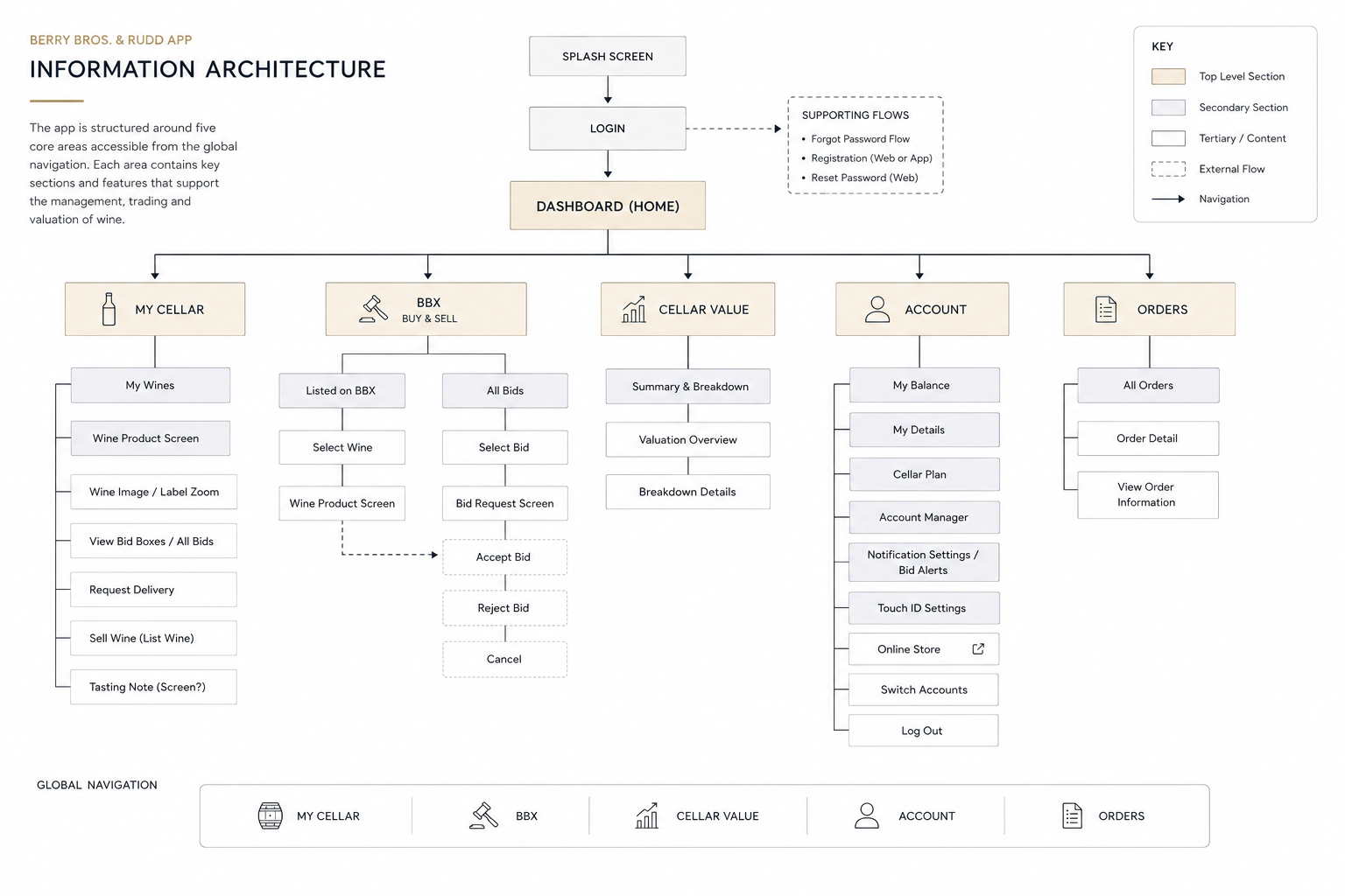
I connected My Cellar, Cellar Value and BBX through clearer navigation and consistent wine information. Journeys separated understanding the collection from taking an action, while prioritisation kept the first release focused on essential tasks. Early flows and sketches allowed the team to review decisions before investing in visual detail.
The navigation model treated cellar management, value and trading as connected but distinct needs. A customer could first understand an owned wine and then move toward an action, rather than encountering a marketplace decision without sufficient context. Consistent wine information across areas supported that transition. Release prioritisation also recognised delivery dependencies: a useful first experience needed reliable core cellar information before adding every possible discovery or trading capability.
The Solution
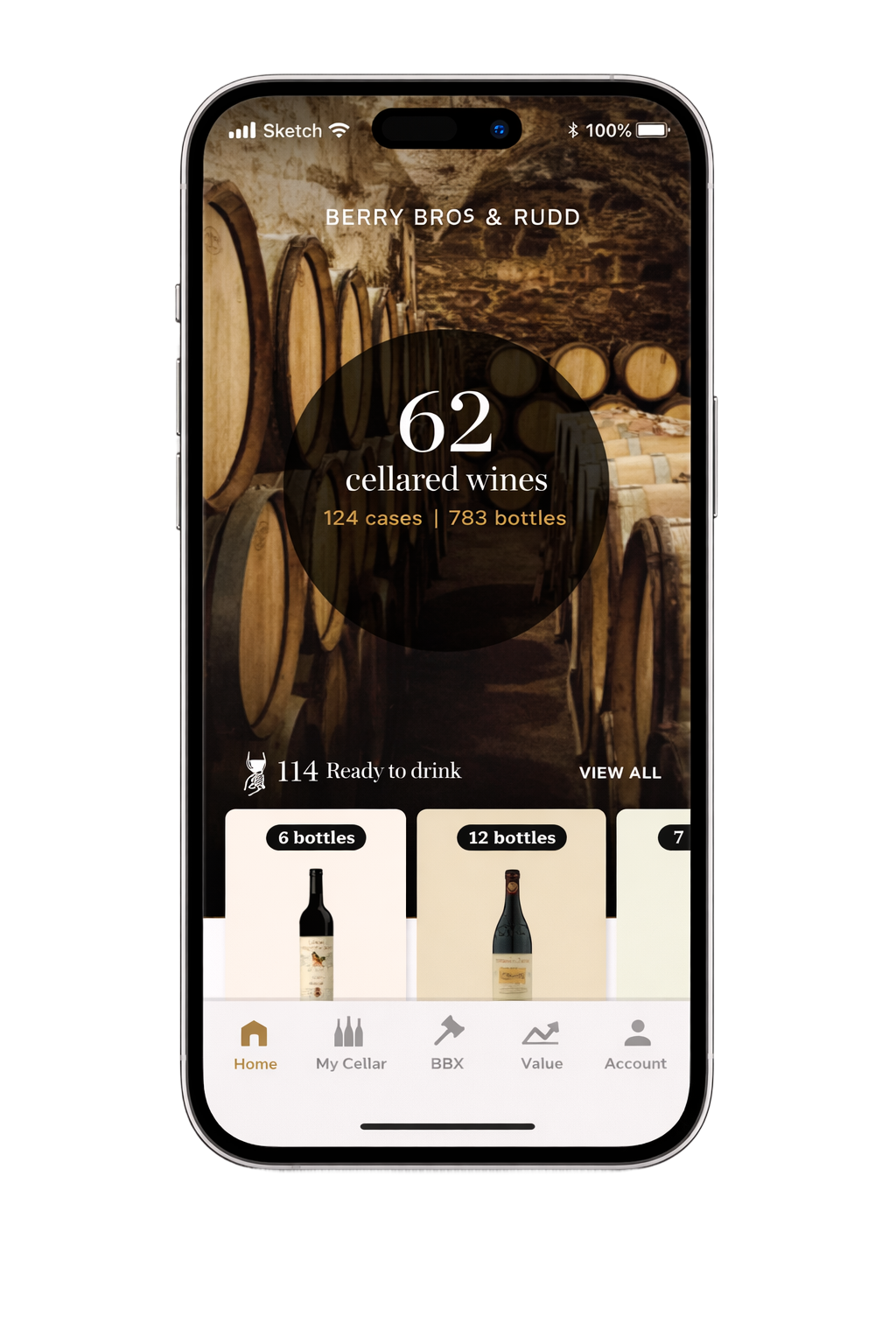
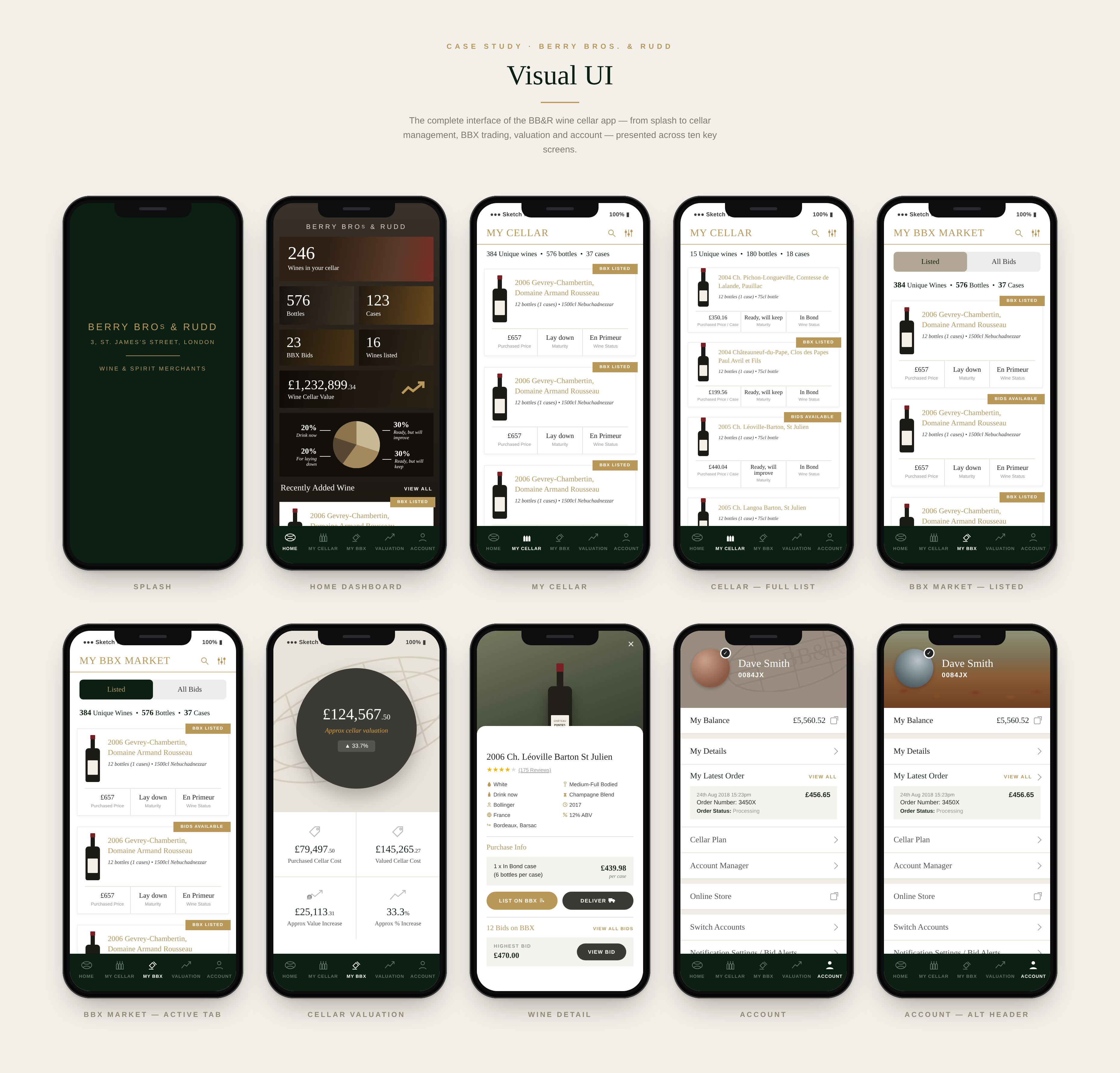
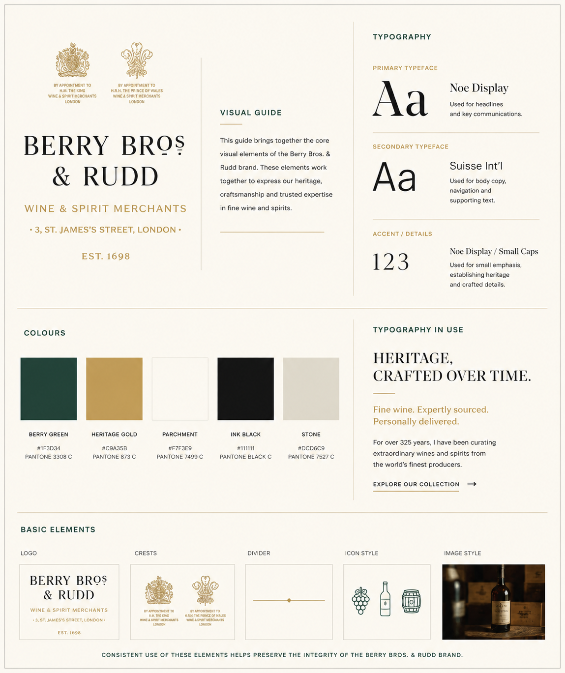
The proposed mobile experience brought the dashboard, cellar, wine details, valuation, marketplace and account areas into a connected structure. Heritage typography, dark green, gold accents and wine imagery expressed the brand, while consistent cards and data hierarchy made complex ownership information easier to scan.
The dashboard offered an entry into the collection, while wine-detail views provided the context needed for a specific decision. Cellar and valuation areas supported different ways of understanding ownership, and BBX supplied a route into trading. The visual direction balanced the brand's heritage with a structured mobile interface. Repeated card patterns and clear data hierarchy aimed to make the experience familiar as customers moved between collection information, marketplace activity and account tasks.
Validation & Iteration
I used realistic tasks to evaluate finding wine, interpreting maturity and quantity, understanding cellar value and moving into trading journeys. Observations of navigation and hesitation guided refinements to the flows and information hierarchy. The case study reports the testing approach without claiming an undocumented participant count.
The most useful evaluation tasks connect comprehension to action: can a customer identify a wine, understand its quantity and maturity, and select an appropriate next step? This helps distinguish a navigation issue from uncertainty about specialist information. The available account describes task-based evaluation but does not establish a complete study record. Future checks should include both experienced and less frequent collectors, particularly when testing valuation language and transitions into trading or withdrawal.
Delivery & Collaboration
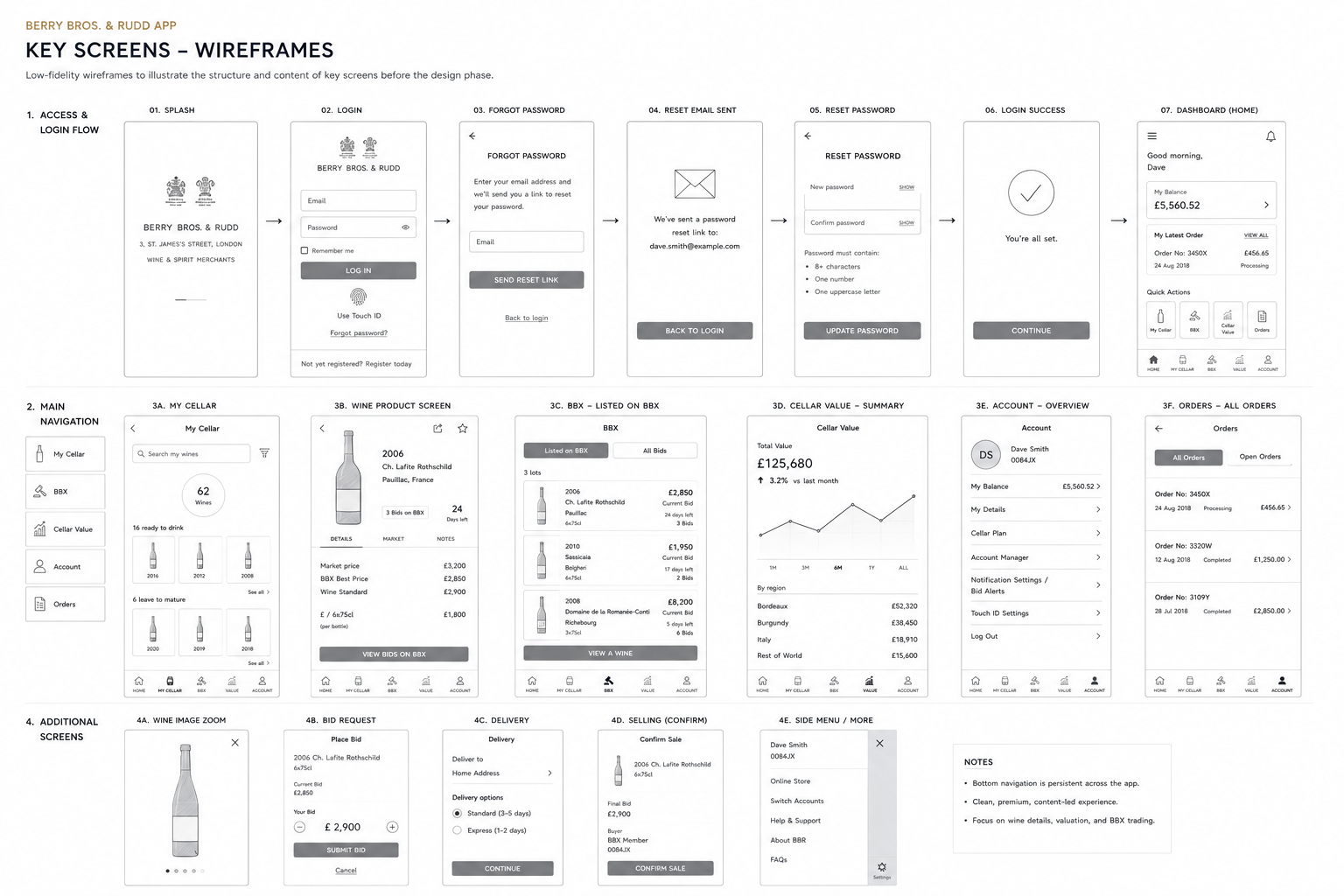
I collaborated with product, business analysis, native iOS and Android developers and backend stakeholders to align the journeys with the first-release roadmap and data constraints. Wireframes and high-fidelity screens communicated navigation, interaction behaviour and the intended brand experience.
The work linked product priorities with the practicalities of native delivery. Discussions with iOS, Android and backend colleagues helped identify where interactions depended on data availability and where the first release needed a narrower scope. Flows provided a reference for navigation decisions; high-fidelity screens communicated hierarchy and brand expression. Keeping these artefacts connected helped the team discuss the intended experience at both journey and screen level.
Outcomes & Impact
The design deliverable established a more connected mobile experience for cellar management and trading. Analytics, usability feedback and commercial performance were proposed ways to assess success after launch; the available account does not establish measured post-launch results. The expected value is clearer decision-making and less fragmented account management.
The resulting design direction brought previously separate collection needs into a connected mobile structure. Its expected value lies in helping customers understand their cellar and choose an action with less reliance on disconnected tools. Demonstrating that value would require post-launch evidence, such as task completion, comprehension of maturity and valuation, and the quality of transitions into trading. Commercial measures should be interpreted alongside those user outcomes rather than used alone to judge usability.
Reflection & Next Steps
The central lesson is to make specialist data useful at the point of decision, without assuming every customer has the same expertise. Further evaluation should check valuation comprehension, readiness-to-drink interpretation and completion of trading tasks across customer experience levels.
The project illustrates how a specialist service can remain approachable without removing useful depth. The key is to give customers the information relevant to their decision and allow deeper exploration when needed. Further work should inspect where terminology, ownership rules or data freshness create uncertainty. The next release could then be prioritised around the most consequential gaps in customer understanding, rather than expanding features before the core collection-management experience is dependable.