
Project Overview
I worked as a UX and Visual Designer on Barclays Mobile Banking across iOS and Android. My contribution included user research, journey mapping, competitor review, wireframes, prototypes and mobile UI design for personal and business banking tasks.
The app needed to bring common banking activities into a mobile experience that customers could understand and revisit with confidence. Some users manage one personal account, while others move between personal and business products. My work connected those needs with the interaction and visual design of account views, payments, transfers and related services, keeping routine transactions central to the experience rather than treating the app as a catalogue of banking features.
The Challenge
Customers needed to view accounts, make payments and transfers and access services from their phones. A broad range of experience levels and account types made navigation and information hierarchy important. The app also needed recognisable behaviour across platforms without letting product discovery interrupt essential banking tasks.
Routine actions can become difficult when account context, product choices and service entry points compete for attention. Customers need to know which account they are viewing and how to move into a payment or transfer without losing that context. The challenge was to support that clarity across different customer needs and two native platforms. Product discovery still needed a place, but essential banking activities required a stronger hierarchy and more direct routes.
Research & Insights
The project account describes research into user behaviour, existing pain points and competitor apps. These activities informed a focus on common transactional goals and easier movement between personal and business products. Detailed study protocols and participant findings are not available in the supplied material.
Research and review of existing pain points helped frame the experience around recurring customer goals. Competitor apps provided a reference for mobile interaction patterns, while the project account emphasises user behaviour and movement between account types. This informed a task-led approach to navigation and layout. The available material does not provide detailed participant findings, so the narrative distinguishes the documented research activities from specific conclusions that would require a study record.
Design Decisions
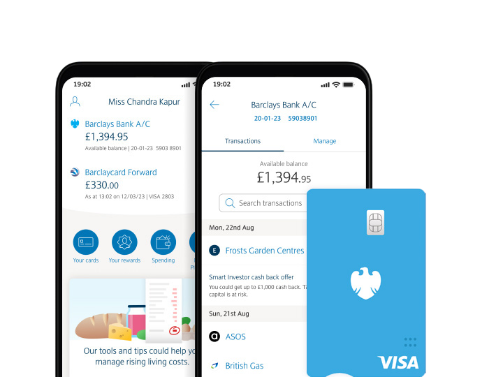
I structured the account landing experience around balances, transactions and direct entry points to payments and transfers. Related services were given clear routes, while contextual discovery reduced competition with core actions. Consistent hierarchy helped keep the experience recognisable across iOS and Android.
Balances and transactions anchored the account landing view, with payments and transfers positioned as recognisable next actions. Related services were organised to support discovery without overwhelming the primary task area. Maintaining a consistent hierarchy across iOS and Android helped preserve familiarity, while the interaction details needed to respect each platform. The design rationale was to reduce uncertainty about where to start and which account a task would affect.
The Solution
The redesigned mobile direction connected account visibility with everyday banking actions and services such as statements, Mobile PINsentry and branch or ATM lookup. Cleaner layouts and consistent navigation aimed to make routine tasks understandable and accessible from mobile.
The mobile direction connected account information with transactional tasks and supporting services. Statements, Mobile PINsentry and branch or ATM lookup extended self-service beyond the main account overview. Cleaner layouts and repeated navigation patterns aimed to make those routes easier to recognise. The selected screens illustrate the presentation direction; the broader experience also depended on the behaviour, confirmation and recovery states surrounding a completed banking action.
Validation & Iteration
I used wireframes and rapid prototypes to explore the journeys with UX colleagues and the wider delivery team. Testers supported quality assurance across devices and customer scenarios. The case study does not claim a particular usability sample or iteration result where those details are not documented.
Wireframes and rapid prototypes supported early discussion of sequence and hierarchy, while testing colleagues reviewed quality across devices and scenarios. Future task-based evaluation should cover choosing an account, completing a payment and understanding the resulting confirmation. It should also examine mistakes and recovery, because success on a straightforward path does not establish confidence when something goes wrong. Detailed usability findings are not supplied in the current project record.
Delivery & Collaboration
I collaborated with project managers, Business Analysts, developers, UX designers, testers and banking stakeholders. The team connected customer needs with banking requirements, platform behaviour and delivery planning, with my focus on interaction clarity and the mobile visual experience.
The design work sat within a wider team connecting customer needs, banking requirements and delivery constraints. Business Analysts clarified requirements, developers informed implementation and testers helped review behaviour across devices. UX collaboration supported consistent interaction choices as the visual direction developed. This shared work is important to the case study: the mobile experience was the result of coordinated decisions, with my contribution focused on interaction clarity and visual design.
Outcomes & Impact
The work contributed to a mobile-first direction for everyday banking and customer self-service. The original account includes onboarding and task-performance percentages, but no measurement window, baseline or attribution is supplied. Those figures are omitted until they can be supported by project evidence.
The design contribution supported a mobile-first approach to everyday banking and access to related services. To demonstrate its effect, future evidence should connect specific journeys with completion, comprehension and error-recovery outcomes. Overall rollout performance can also reflect operational or product changes, so it should not automatically be attributed to interface work. The case study therefore presents the scope and design rationale without treating unsupported percentage claims as verified results.
Reflection & Next Steps
For banking, speed should be assessed alongside comprehension and confidence. Further evaluation should measure payment completion, error recovery and navigation between account types, while separating the contribution of interface changes from broader product and rollout effects.
The work reinforces that convenience and confidence need to be evaluated together in financial services. Fewer steps are beneficial when customers still understand the account, amount and consequence of an action. Further evaluation should compare the experience across account types and customer confidence levels, including recovery from incorrect selections. That would help identify where a simpler interaction supports safe completion and where additional explanation or confirmation is useful.